Konnect Motion Brand Video
Video · Design · Animated Brand Video
Client
NZ Trade Group
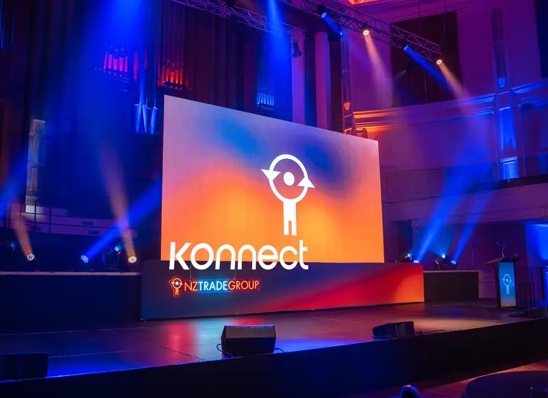
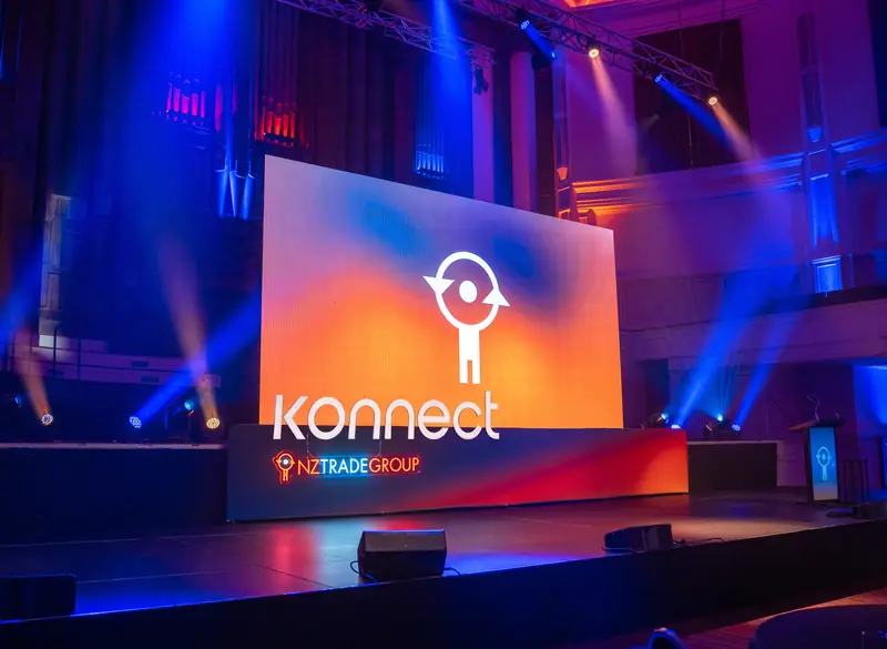
An animated brand video for Konnect, NZ Trade Group’s national member and supplier conference.
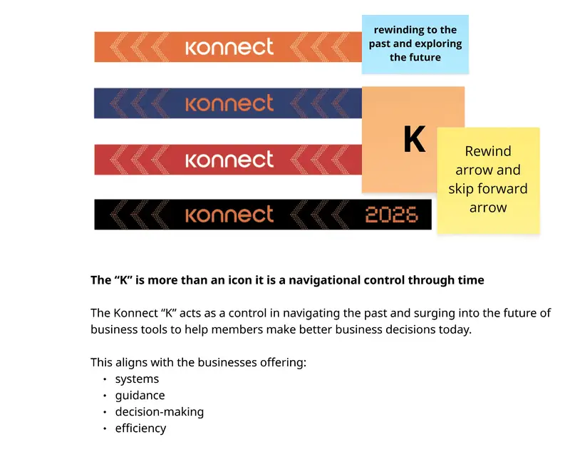
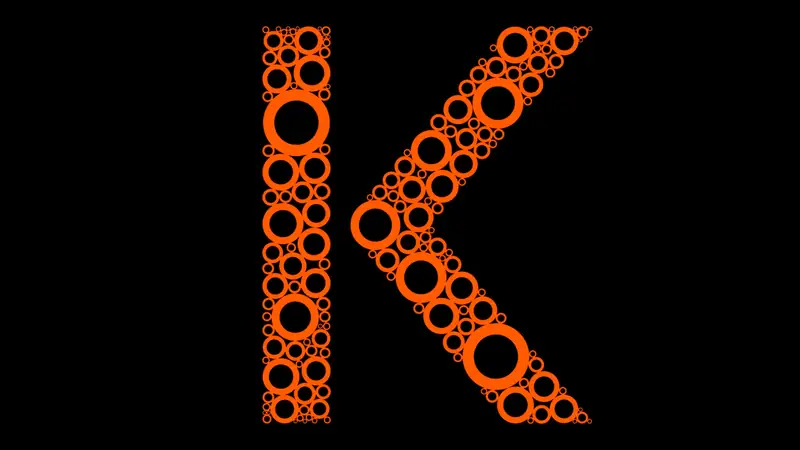
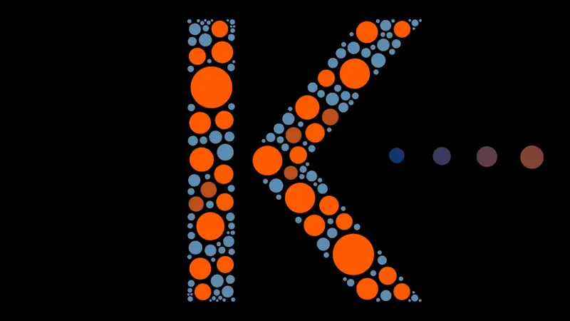
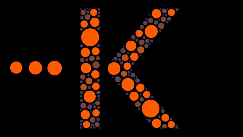
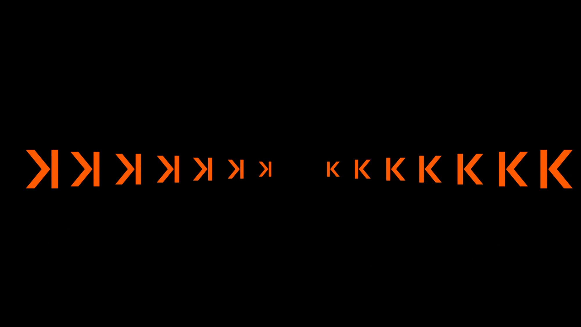
The K from the Konnect logo came to life as a rewind arrow, skipping back through the years to celebrate NZ Trade Group’s 20th anniversary and its progress in technology.
Role
Design & Content Lead
Year
2026
Skills
Motion design, animation
Retro intro
The passage of time
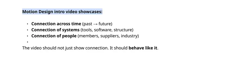
A central creative concept behind the Konnect conference was the passage of time, reflecting NZ Trade Group’s 20-year milestone in business.
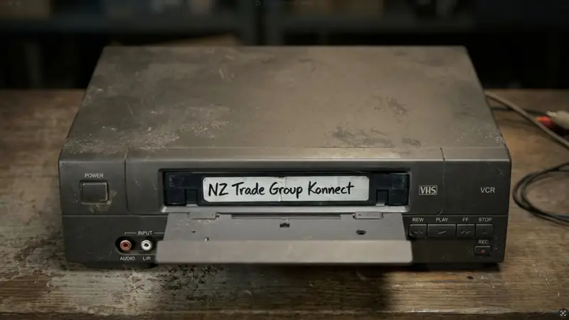
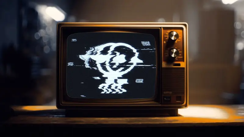
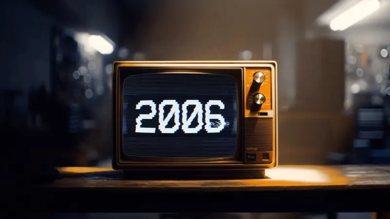
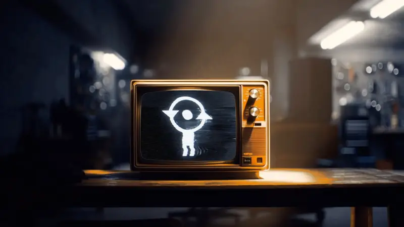
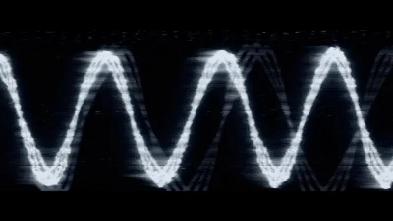
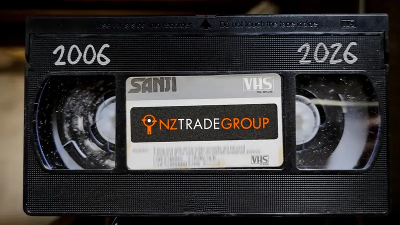
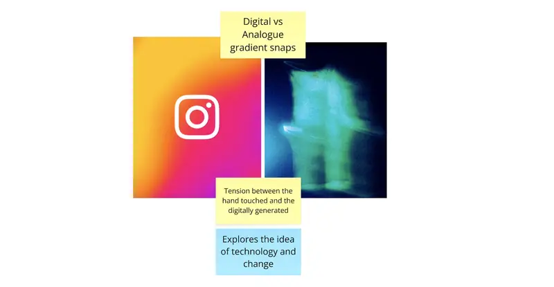
The conference introduction opens with a vintage, dust-covered VHS player and a tape labelled NZ Trade Group Konnect. As the tape is inserted, the scene transitions to an old television screen displaying a heavily distorted and glitched interpretation of NZ Trade Group’s brand symbol, Tāne. This deliberate use of visual distortion builds anticipation, introducing an element of tension and unease as the audience is drawn into the experience.
The visual direction draws on a nostalgic, early-2000s aesthetic, using a subdued palette of deep, cool blues alongside warm, retro tones to subtly represent NZ Trade Group’s two core brand colours.
To ground the concept in the era, I drew inspiration from the basement garages and family spaces of 2006, when VHS players and older television technology were still familiar in many homes and businesses. This created a sense of authenticity and nostalgia, establishing the visual setting for a conference celebrating two decades of NZ Trade Group.
Code & pop-ups
Technology and software development
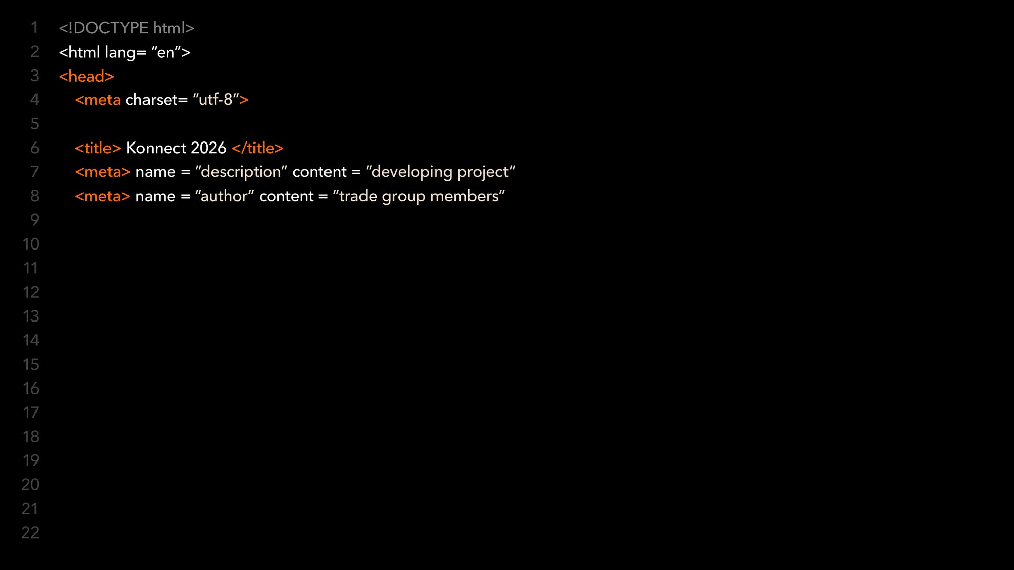
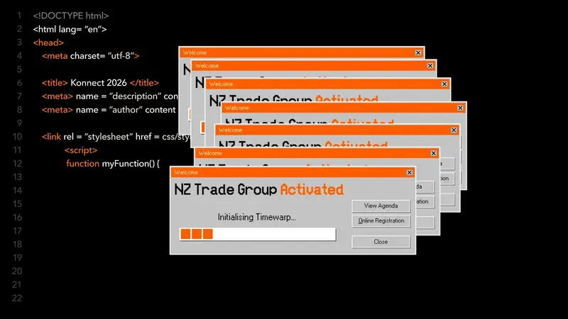
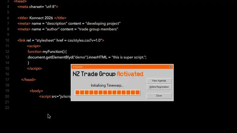
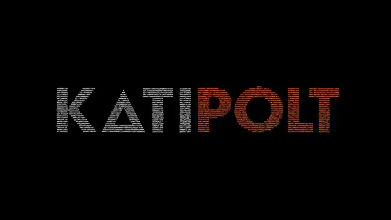
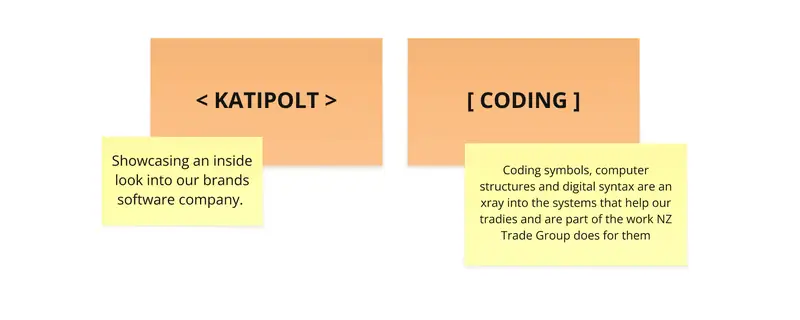
The code represents NZ Trade Group’s software, Katipolt. Katipolt is software which assists electricians to plan, purchase and install electrical components. The code reflects the software and coding teams which work to bring the software to our electrician members.
The running code also begins initialising a pop-up window reminiscent of Windows 95 and computer interfaces popular in 2006. It initialises Timewarp, a preview for a button which, when clicked, initiates a time machine into the 2026 Konnect conference.
Kinetic type & tunnels
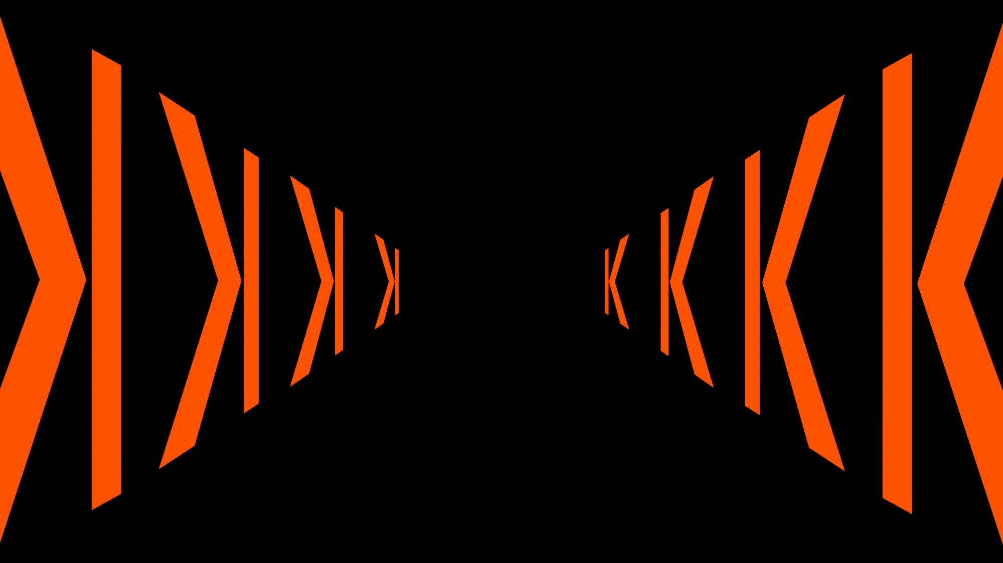
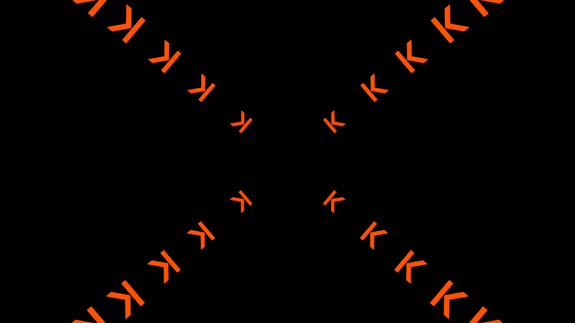
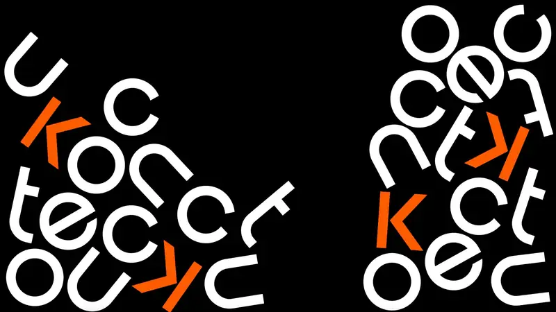
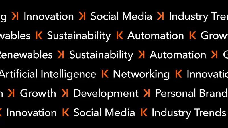
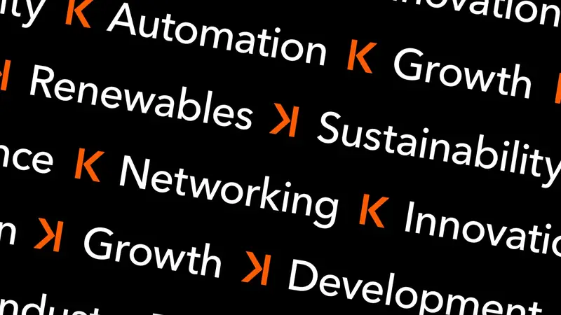
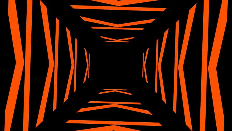
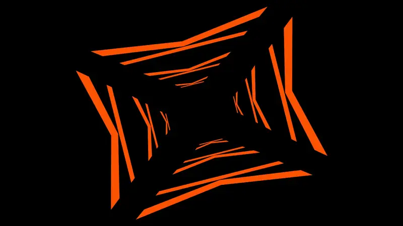
A journey across time
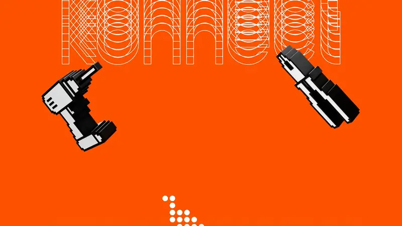
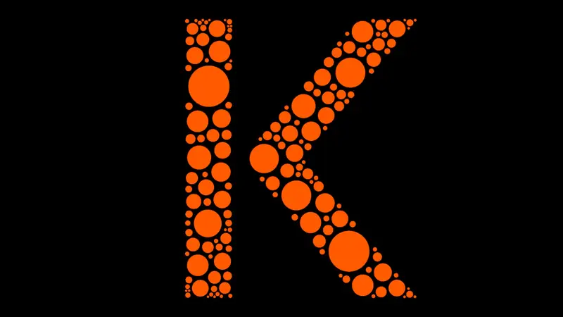
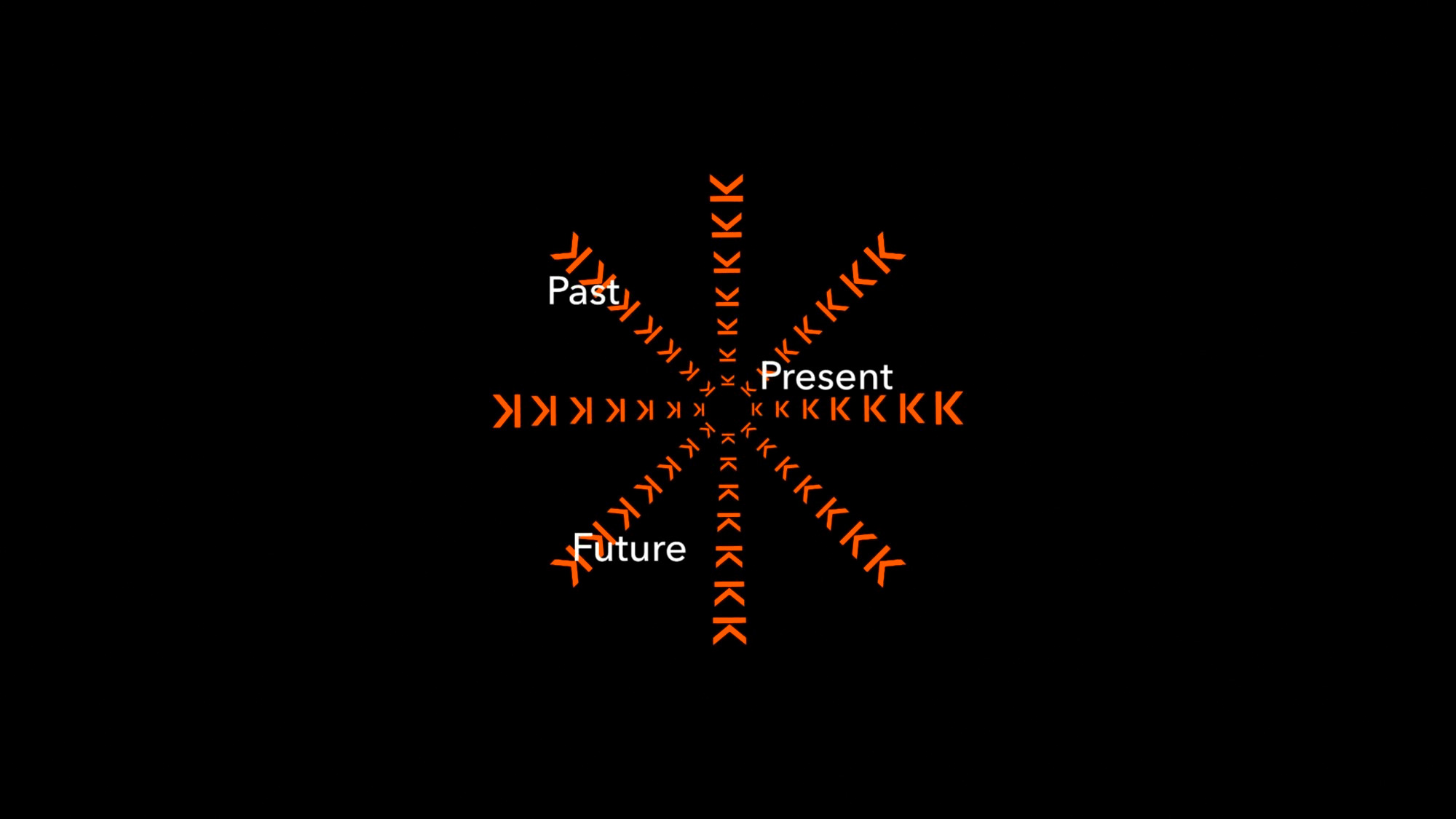
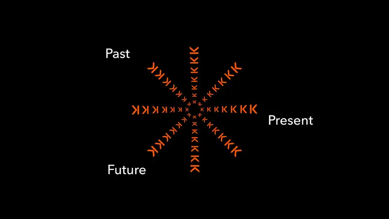
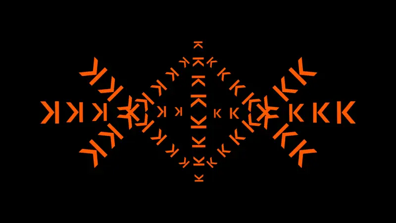
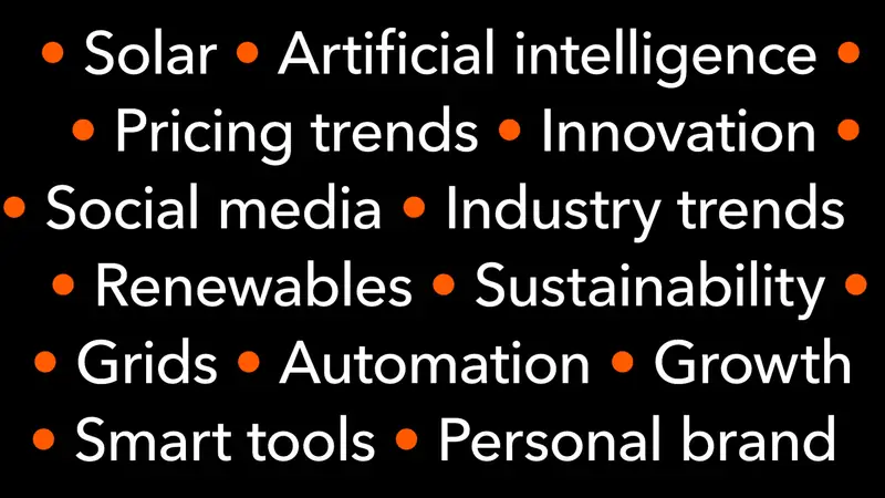
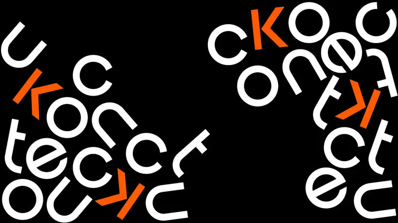
Kinetic typography is used to create depth and a feeling of 3D movement, which draws the audience in. The letter K from the Konnect brand identity doubles as a skip-forward arrow. This arrow is used to create direction and lead the eye into a time-warp tunnel effect, introducing some key conference themes.
Locations & title cards
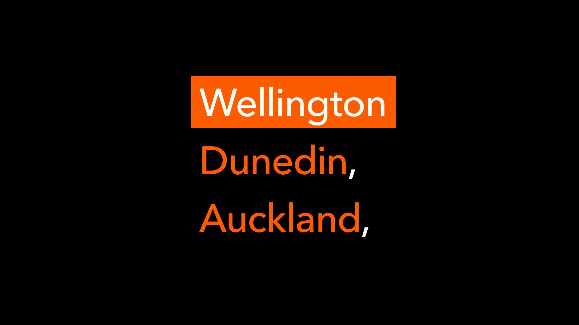
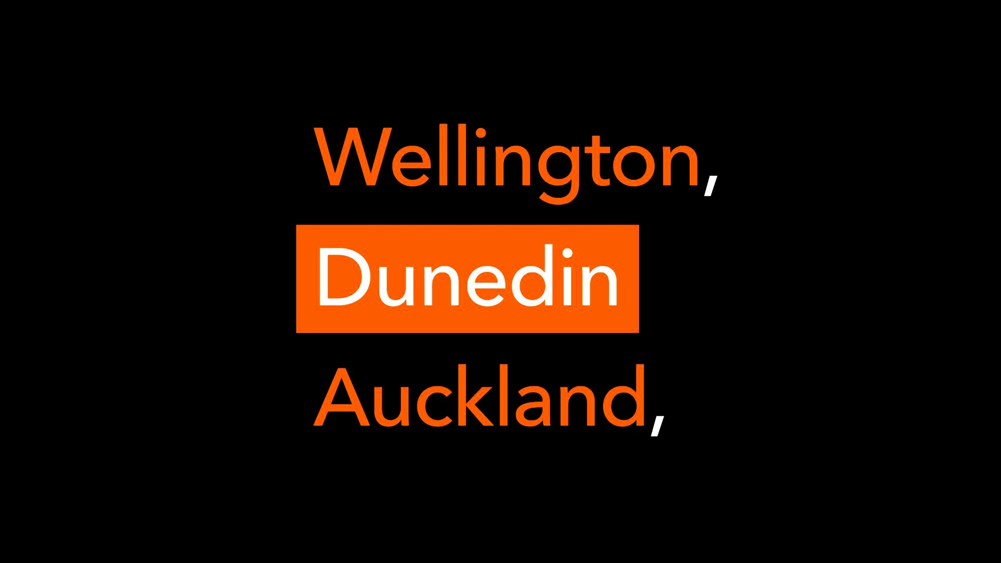
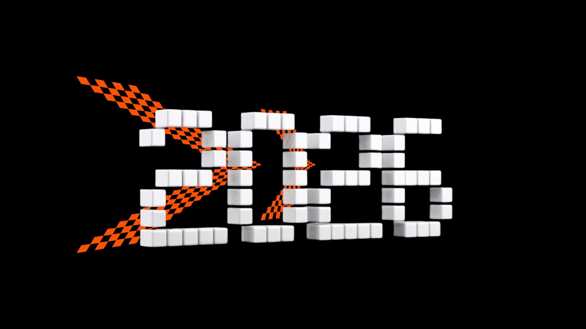
Nationwide electrician network
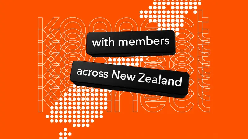
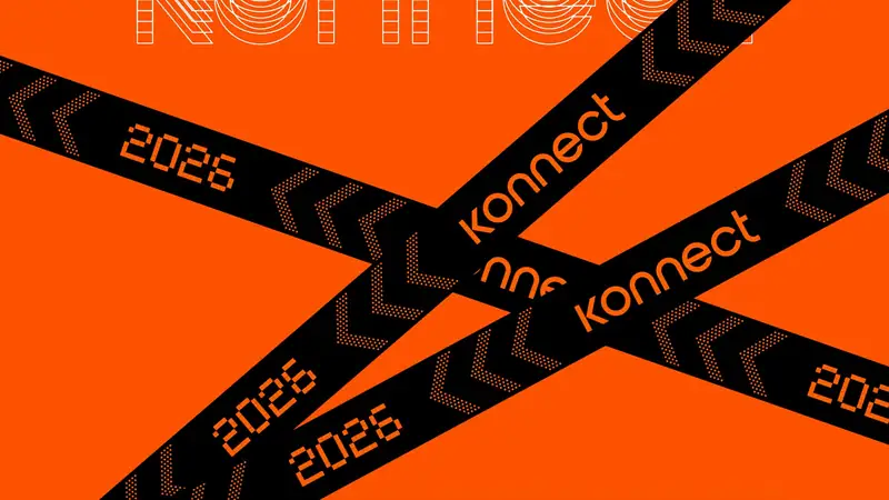
This section showcases the three event locations, the year, the idea of connecting members through a conference across a nationwide network of members, and some event lanyards.
It finally lands on a key title screen introducing the title, in which the arrow from previous sequences flies in from the left and swoops in, revealing the text behind it. It states that this is a member and supplier conference powered by NZ Trade Group.
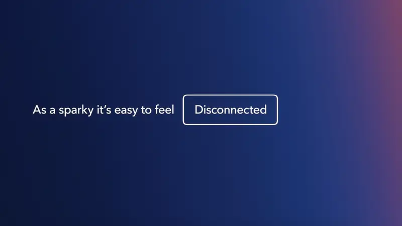
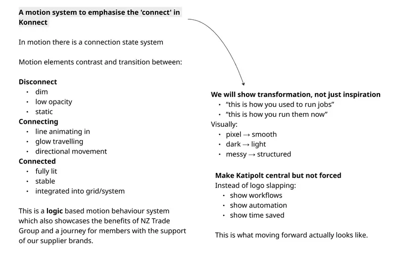
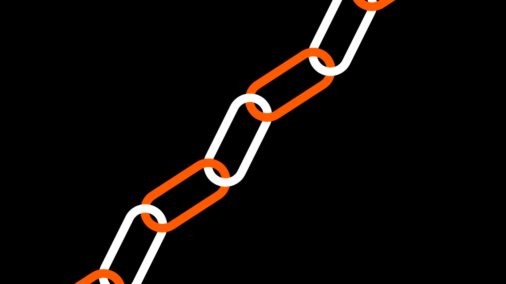
Disconnected to connected
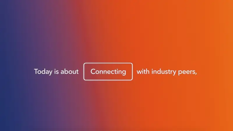
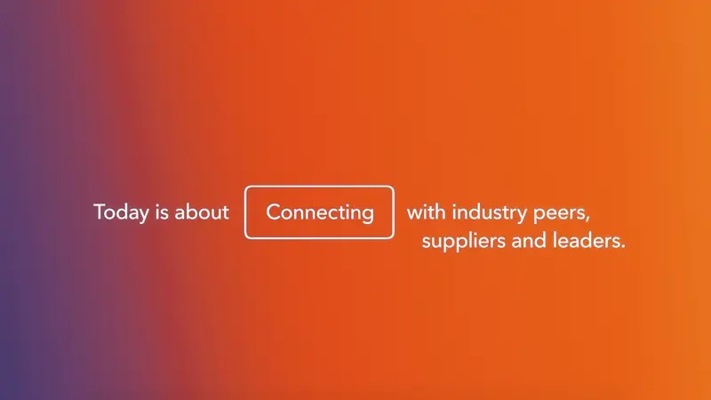
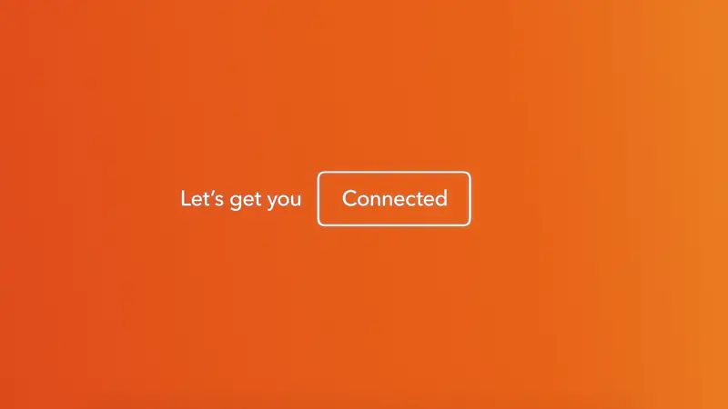
Bringing industry members together from isolation
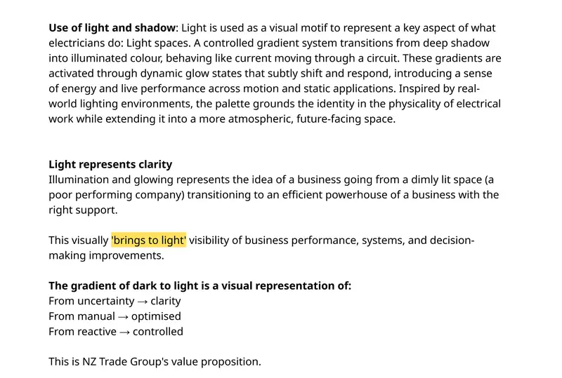
This section takes NZ Trade Group’s two core brand colours, orange and blue, and shifts them through a glow which slowly fades across the screen.
This blend represents light. Light is a core part of an electrician’s role, bringing light into the homes of many commercial and residential properties.
This warm light in the cold surrounding light represents a transition from disconnected, to connecting, to connected.
The conference offers a warm place where electricians can build stronger networks and feel close to the industry. Being disconnected, they may feel isolated coming into the event, represented by the cold light. The text is overlaid to strengthen the message of the gradient as a tool to communicate this feeling of inclusion and belonging.
Networks & software
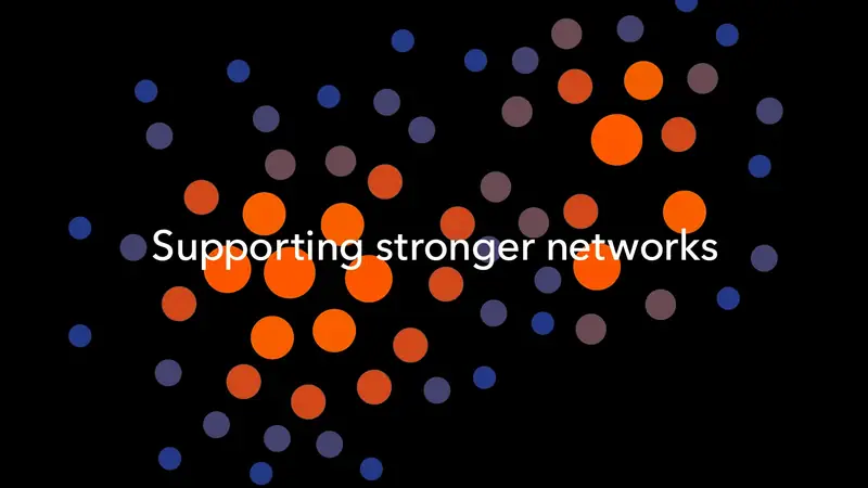
Highlighting the benefits of Katipolt software
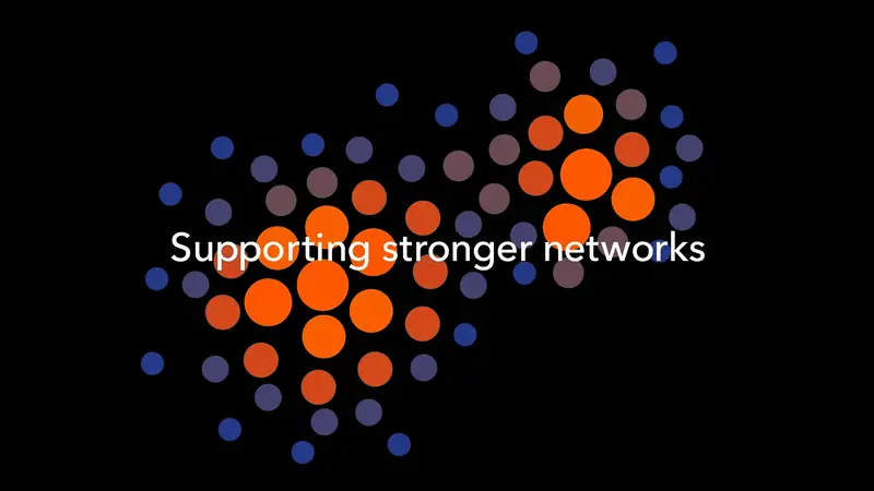
This section also uses the idea of disconnected, connected and connecting from the previous sequence, as the large orange dots represent people networking and coming together. The gradient shifts and becomes warmer as the isolated electricians interact with others at the conference.
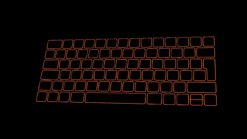
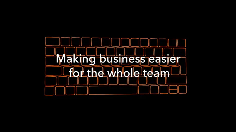
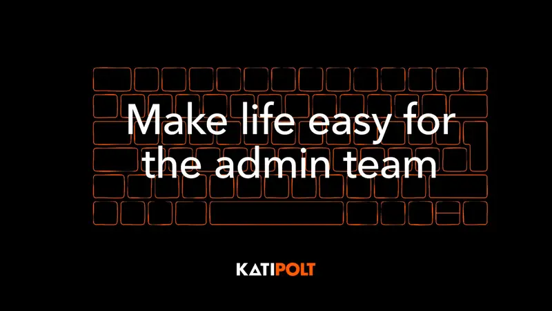
The keyboard is a symbol of technological developments in the industry and promotes Katipolt. Katipolt is “Making business easier for the whole team.” It connects the office admin with the boys on site and makes the whole process seamless.
The Katipolt logo then reveals line by line in a coded-style reveal with lines of code.
Celebrating 20 years
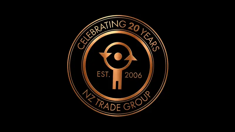

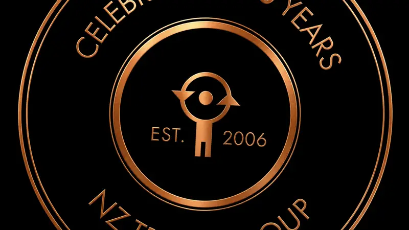
An important business milestone.
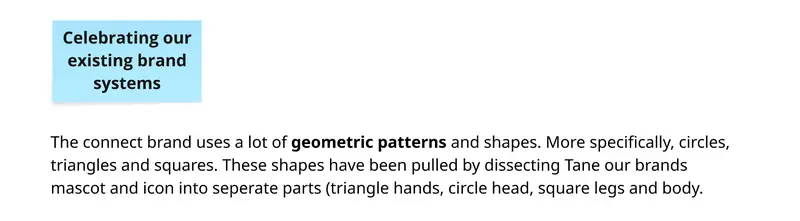
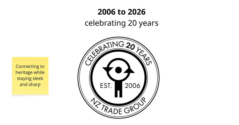
I designed a custom emblem to celebrate 20 years of NZ Trade Group, 2006 to 2026.
I then animated the design to explode in 3D depth, drawing the viewers in with motion similar to the scene about moving through time.
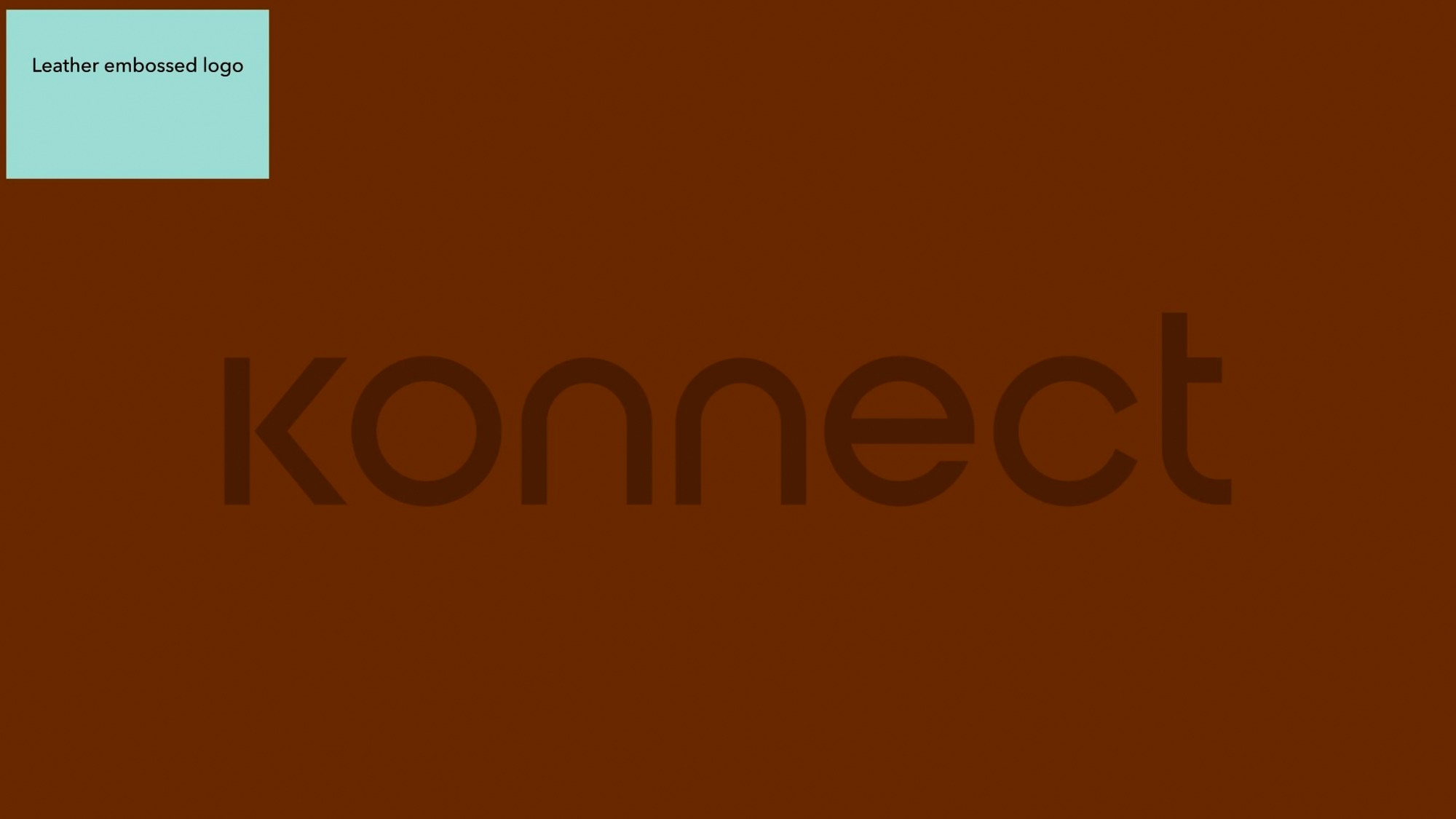
I animated a copper-textured look onto the logo to give a nod to the industry and copper, which is frequently used in electrical components and products.
This also gives the emblem a premium metallic feel and somewhat ties it into the orange from the NZ Trade Group brand guidelines in a cleaner and more elevated way for this significant event.
The logo in the world
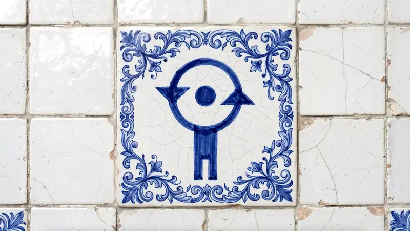

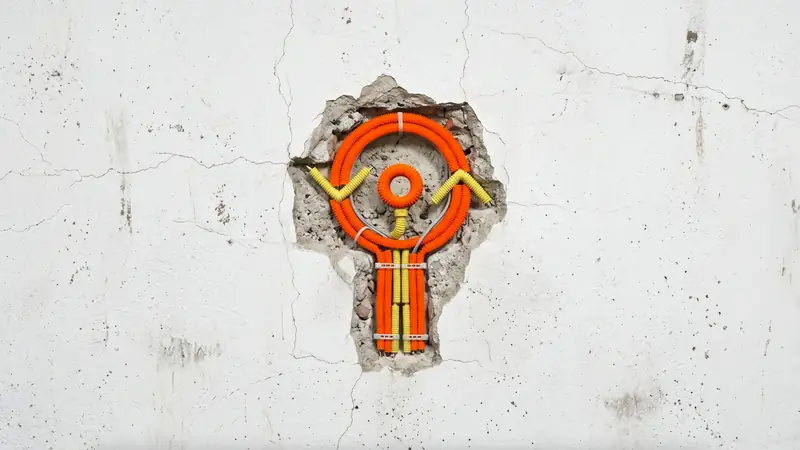


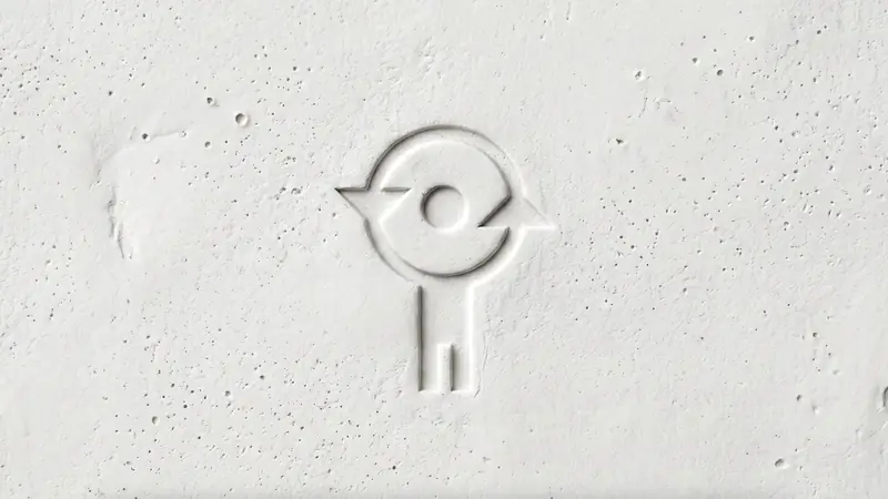
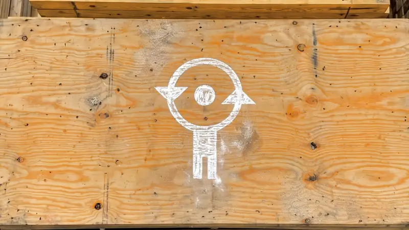

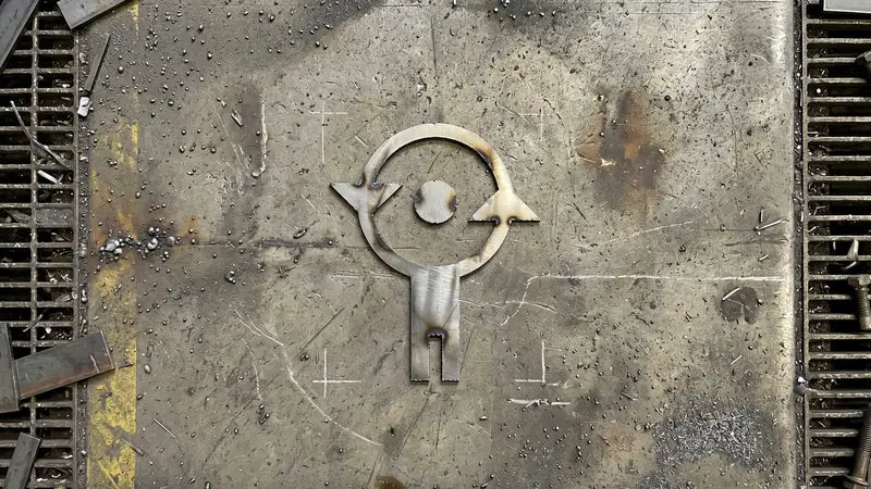
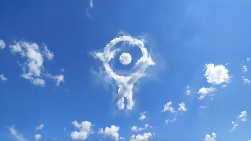
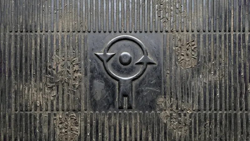
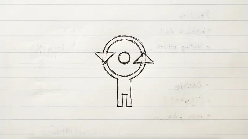
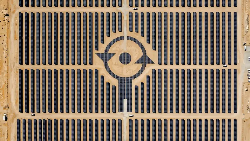
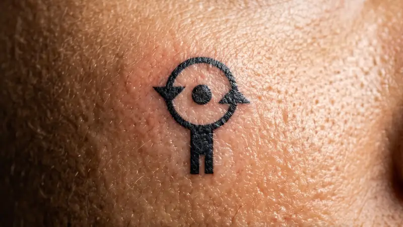
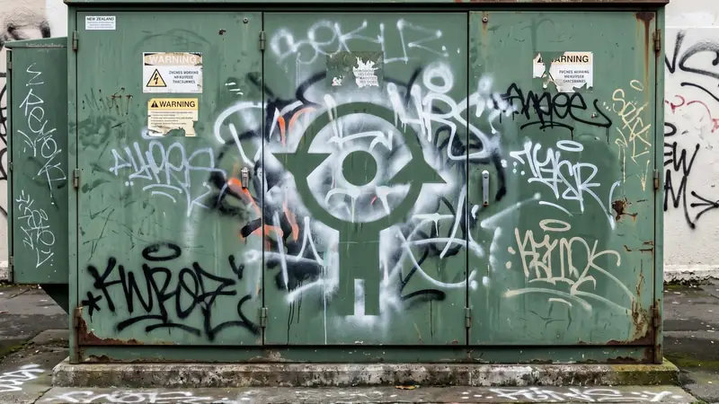
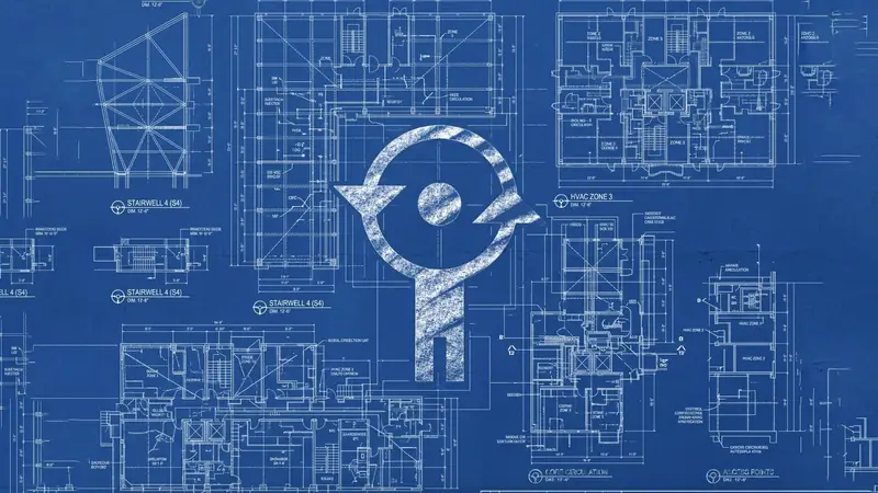
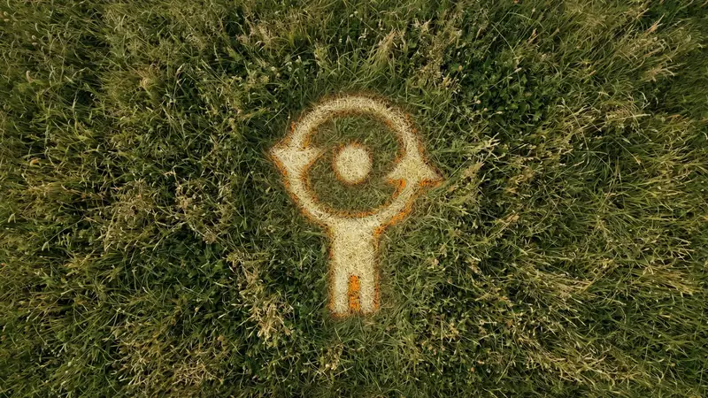

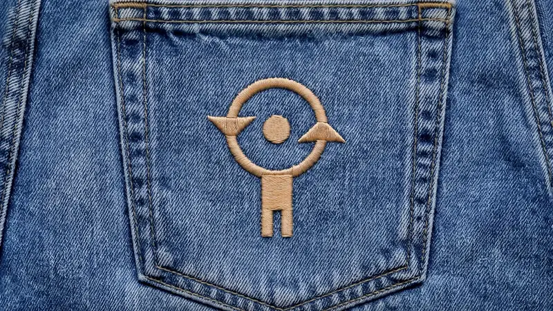
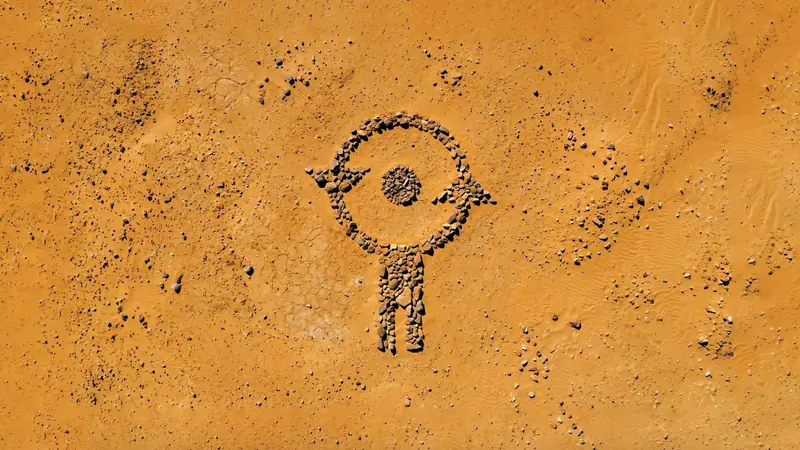
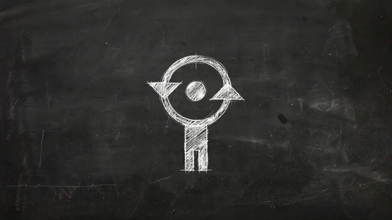
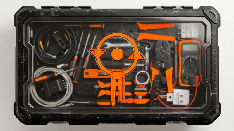

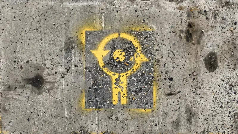
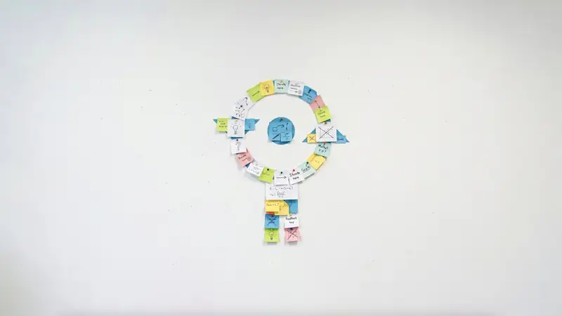
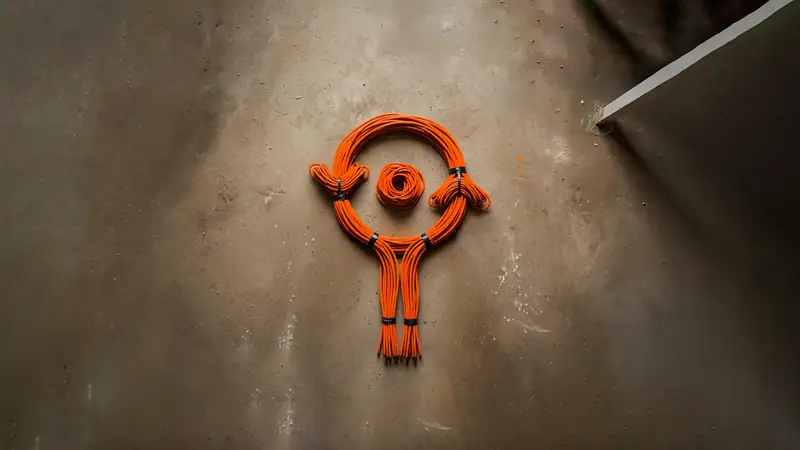
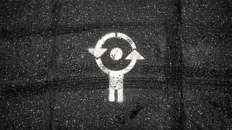
A brand with impact in many places.
The final sequence is a flickering of our brand logo in a range of patterns and places unique to the construction and trade industry. This represents the diverse places and people who are impacted by the work of our business across New Zealand.
Generative AI was used to produce these flickering graphics, and it was also used to wrap up the video. In 2026, the most relevant new technology on the horizon for NZ Trade Group is AI. So, using AI in this process felt like a great way to showcase the difference in time travelled from the beginning of the video, with VHS tapes and old-style box TVs, to a fast-paced, ever-evolving world in 2026, where the business is now.
Outro
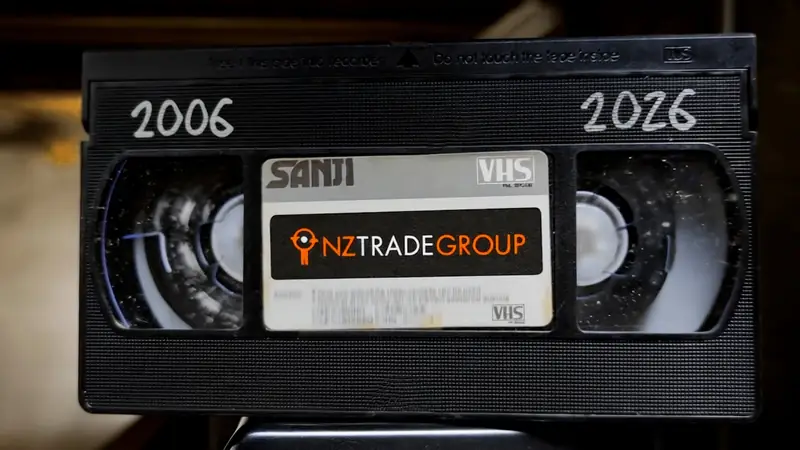

Memories of the past.
The video then clicks back to a floating VHS tape falling backwards in slow motion, with the dates 2006 and 2026 shown on the tape. This ties the end of the video back to the start. It creates visual intrigue and makes the viewer question if they were meant to watch and see that transition from 2006 to 2026.
It’s like a hidden tape in a basement about the brand’s journey, and it seems to feel like the glitches and watching the video may feel like a hallucination or distorted memories from the past. It is a warped take on time travel and a brand’s journey across time.
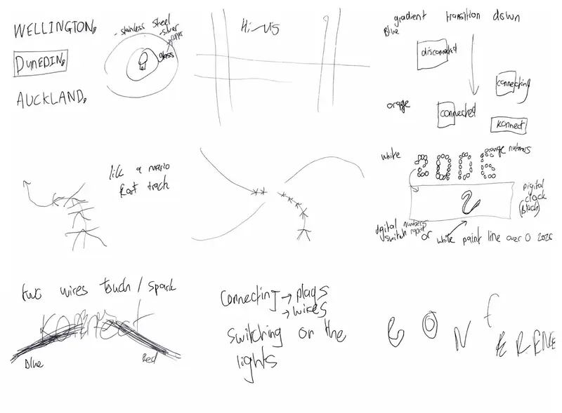
Initial brainstorm
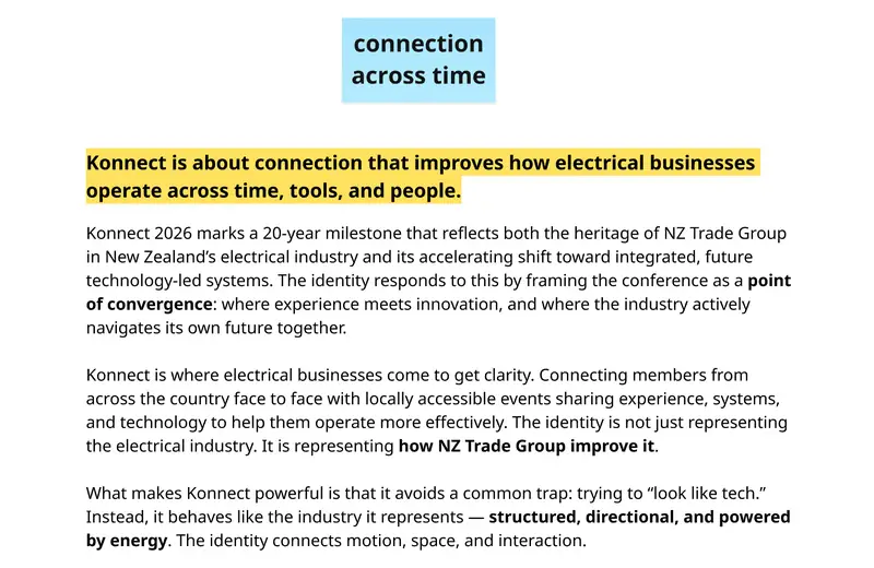
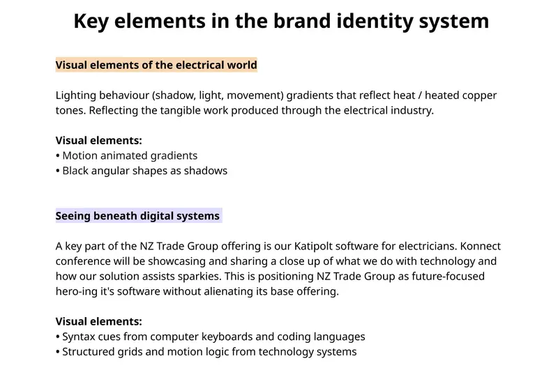
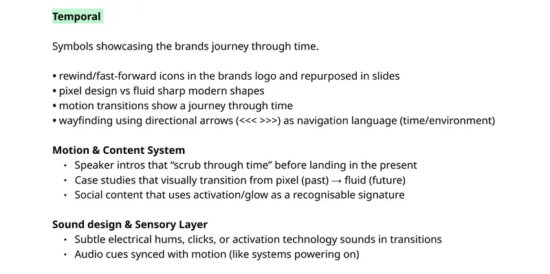
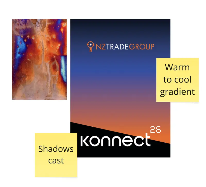
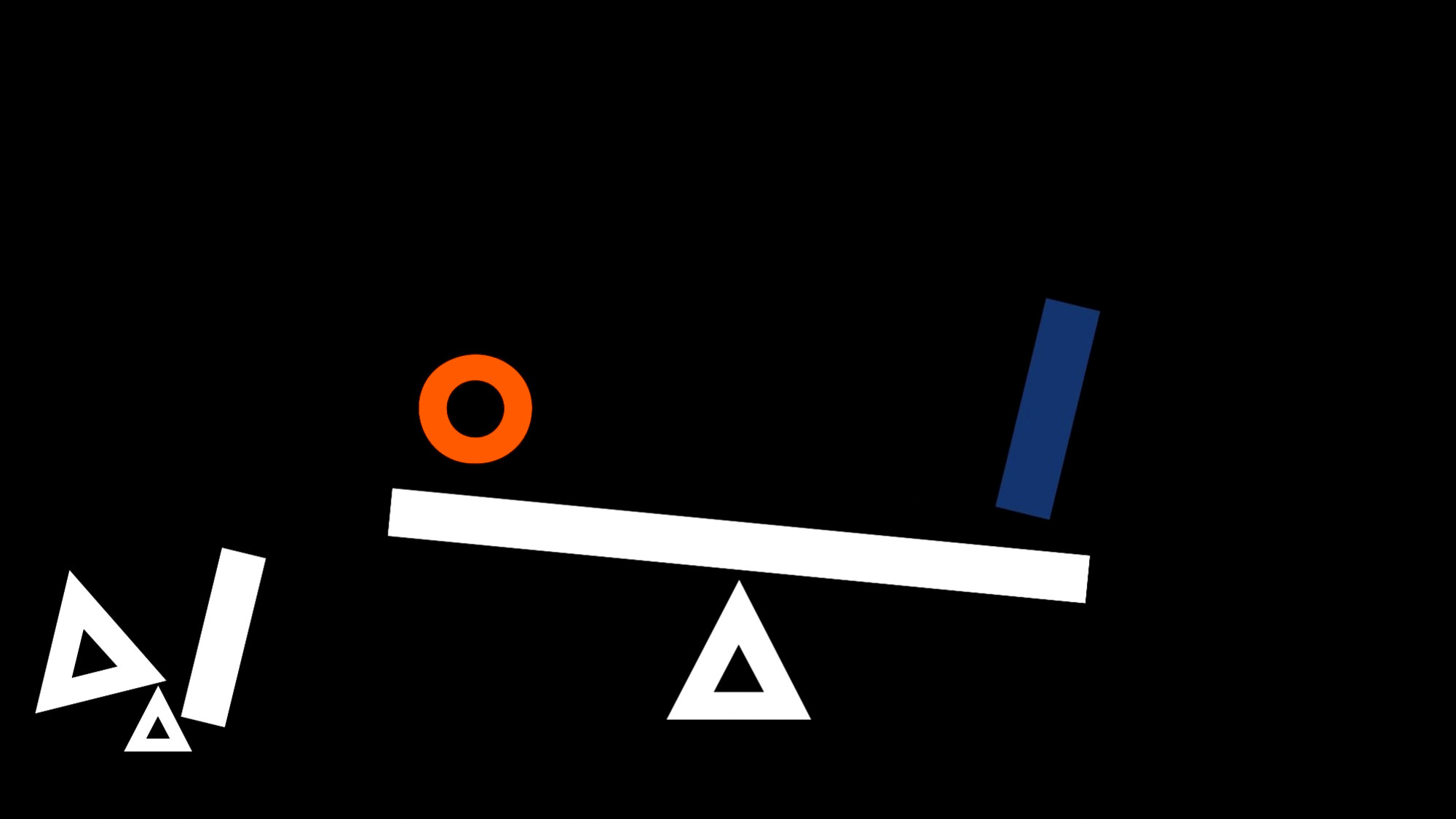
Concept sketches
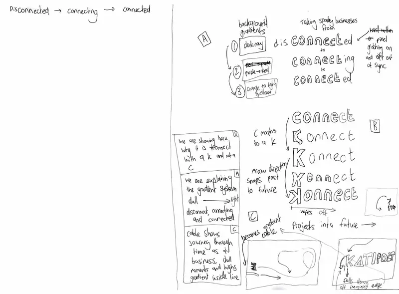
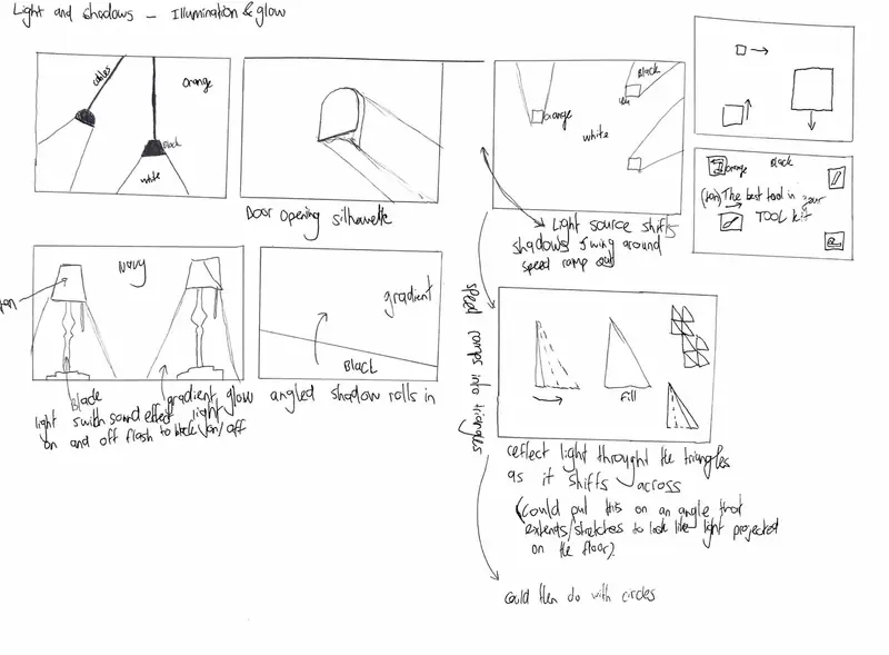
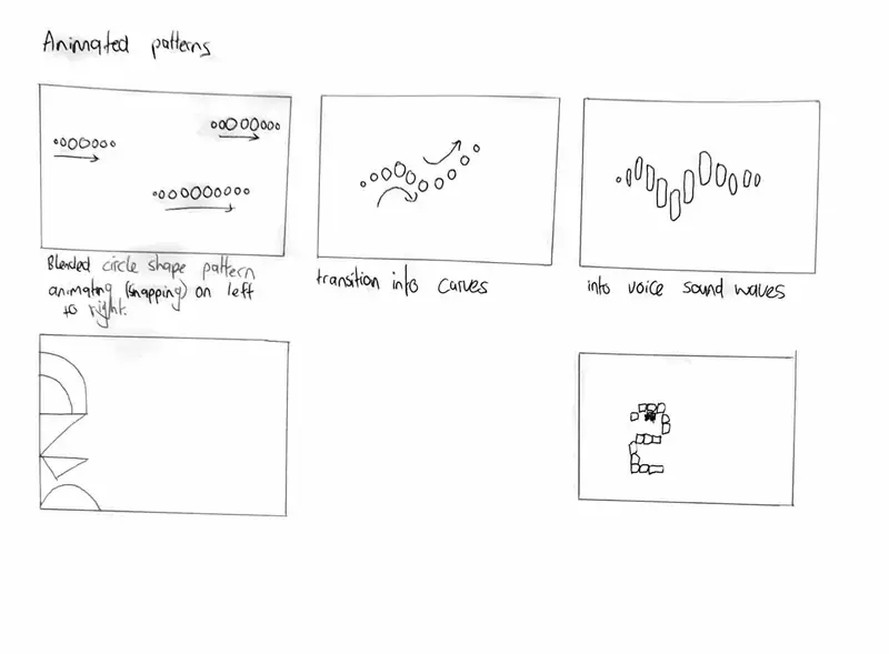
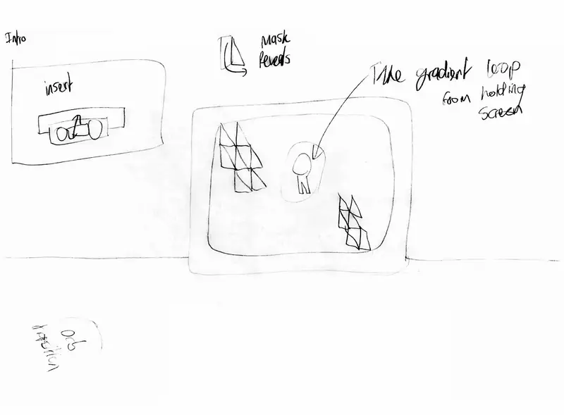
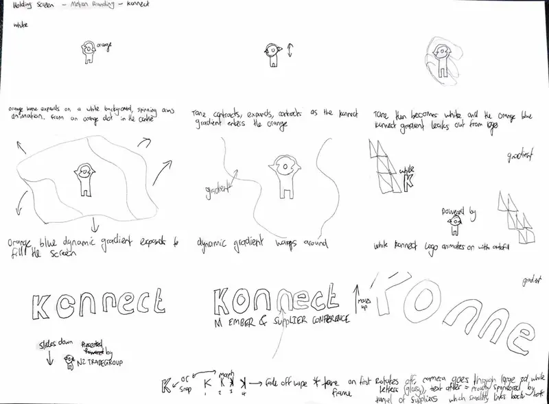
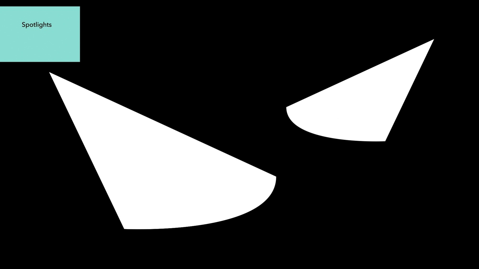
Lo-fi animation still frame development
See more NZ Trade Group projects
Shared with permission from NZ Trade Group