Konnect Conference Design System
Design
Client
NZ Trade Group
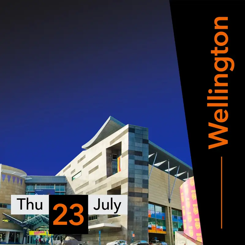
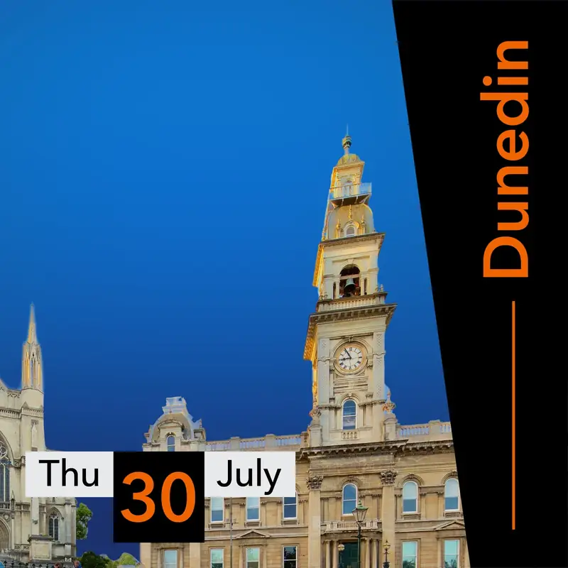
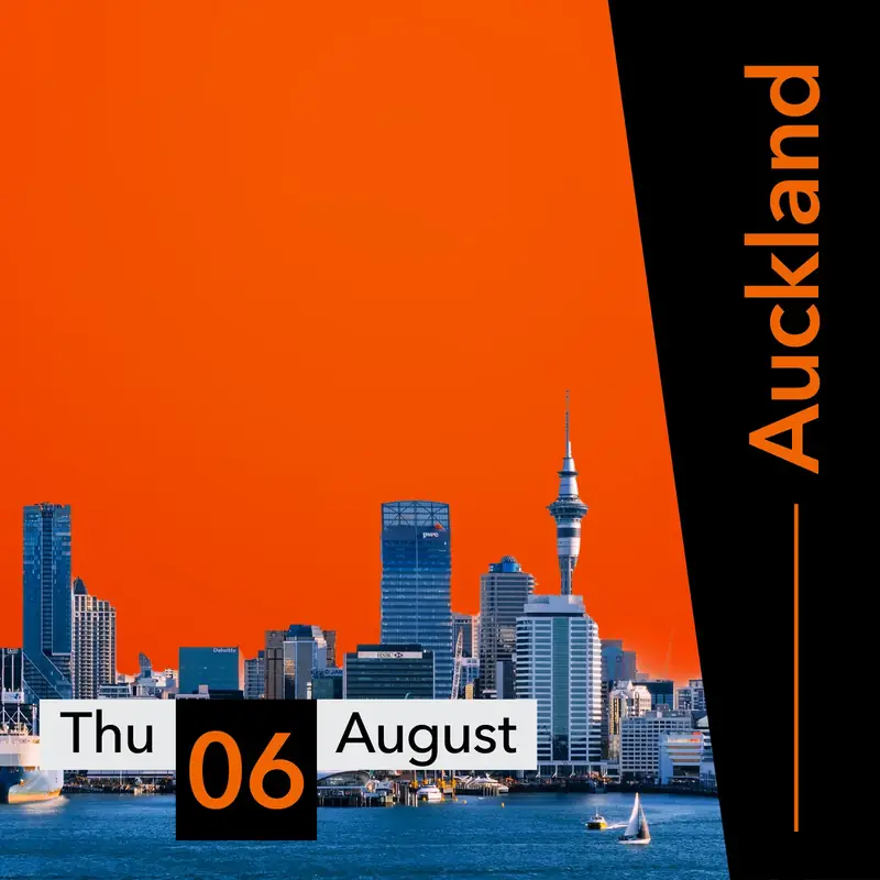
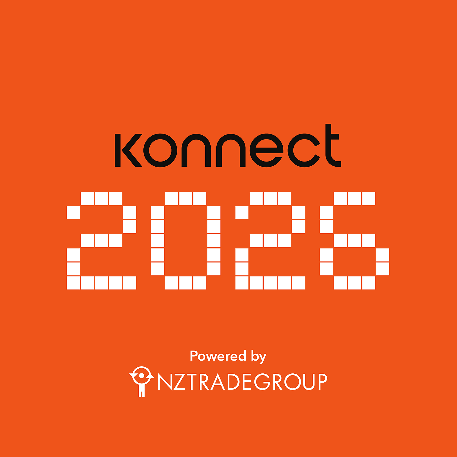
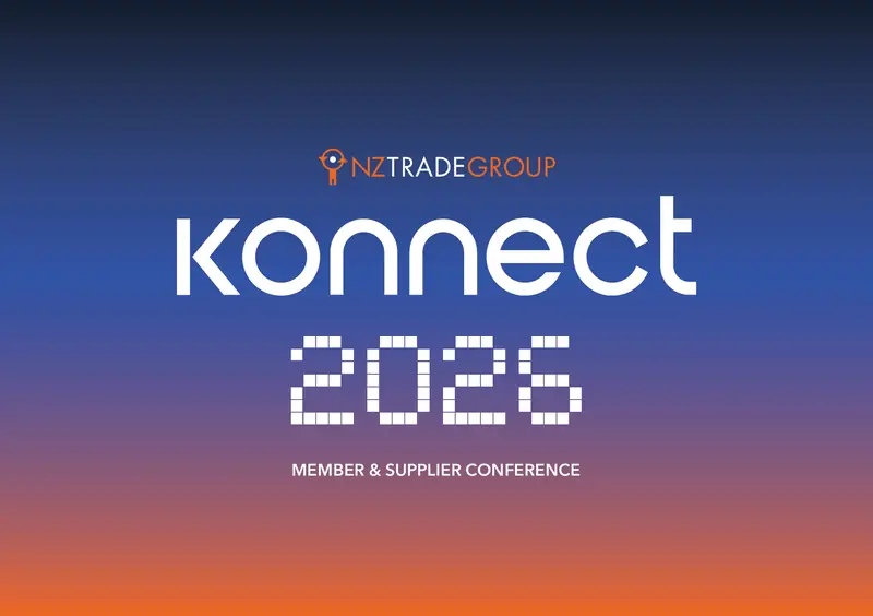
Creative direction and visual identity for Konnect, NZ Trade Group’s member and supplier conference, run as three national events engaging more than 500 attendees in Wellington, Dunedin and Auckland.
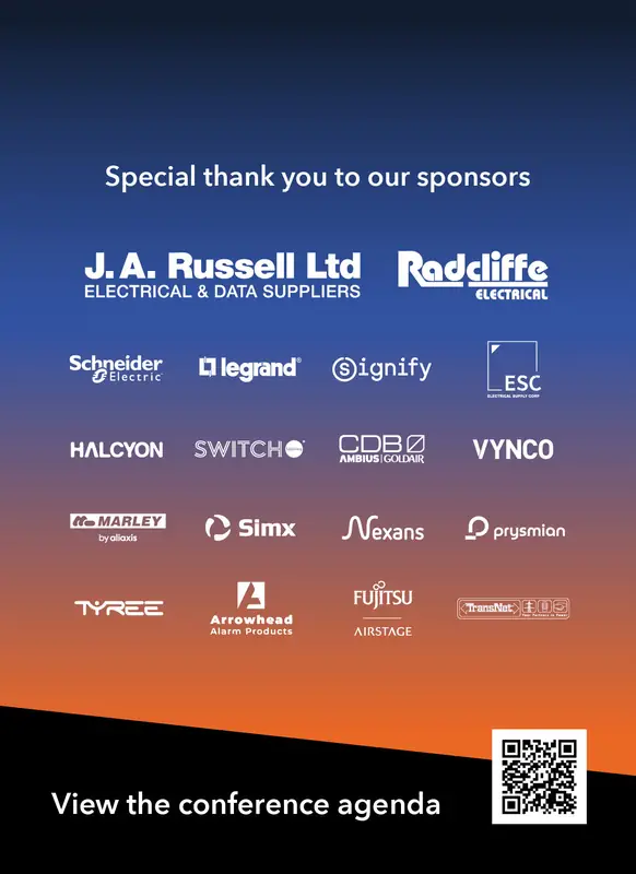
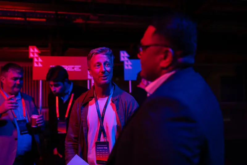
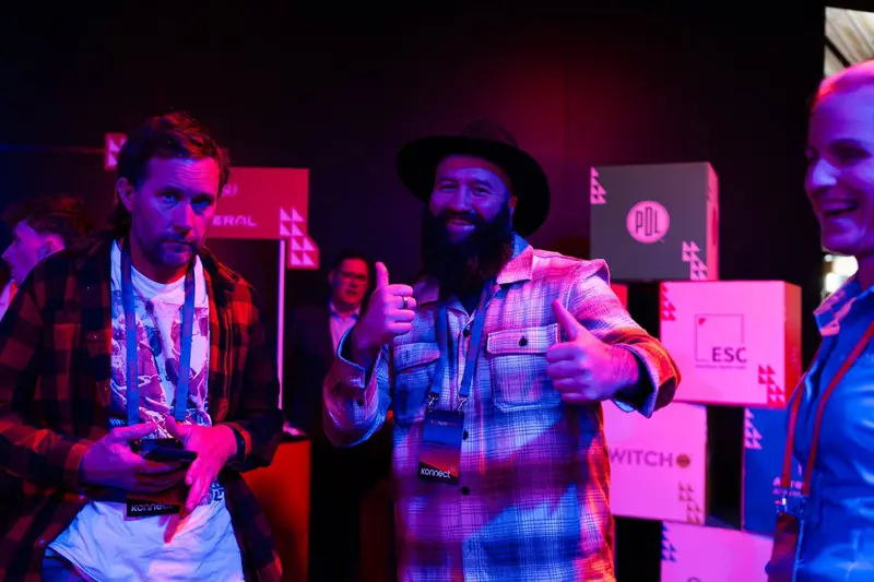
The identity and design system carried across collateral, lanyards, supplier promotions, signage, motion design and social posts.
Role
Design & Content Lead
Year
2026
Skills
Creative direction, design system and brand identity design, motion design, print craft, typography, pattern design, experiential marketing, event signage, campaign, presentation, merchandise and prop design, photography and videography
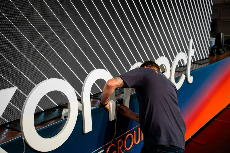
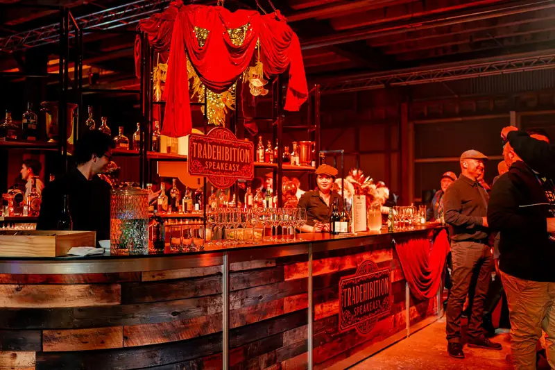

Concept sketch
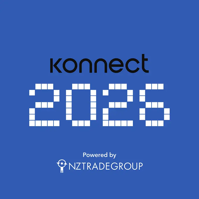
I was told by the head of marketing that NZ Trade Group (NZTG) would be hosting three national conferences next year, and that we could either call it ‘Konnect’ or ‘Connect’. It was up to me to explore some visual ideas to carry the event’s identity.
I opted to design the identity around Konnect with a K because NZTG’s core business offering is named Katipolt, a job management software for electricians. The conference would be heavily showcasing that software and its features to our members across the country, so it made sense to give a nod to the software.
Some of the early criticisms were that Konnect with a K reminded people of the Kardashians, and others thought it could be seen as a spelling mistake. I pushed for the idea as the value and meaning behind the brand name outweighed these misconceptions.
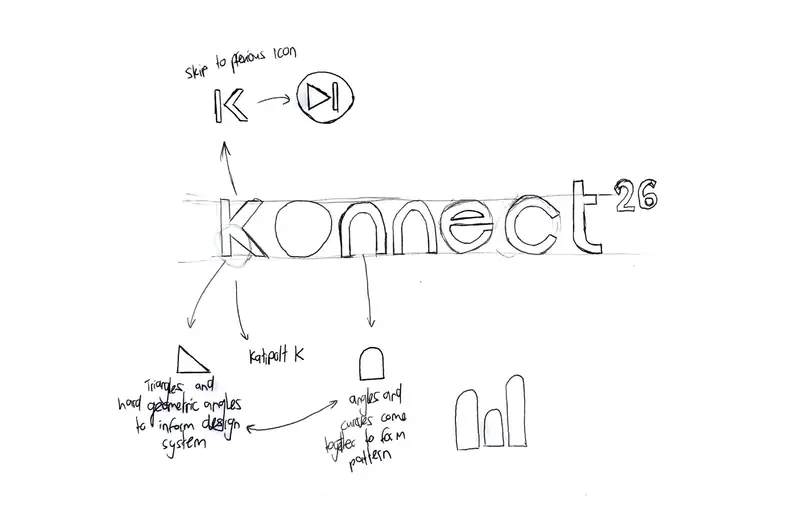
Geometric shapes
As I designed the logo, I circled geometric shapes within the lettering: triangles, circles, rectangles and semicircles.
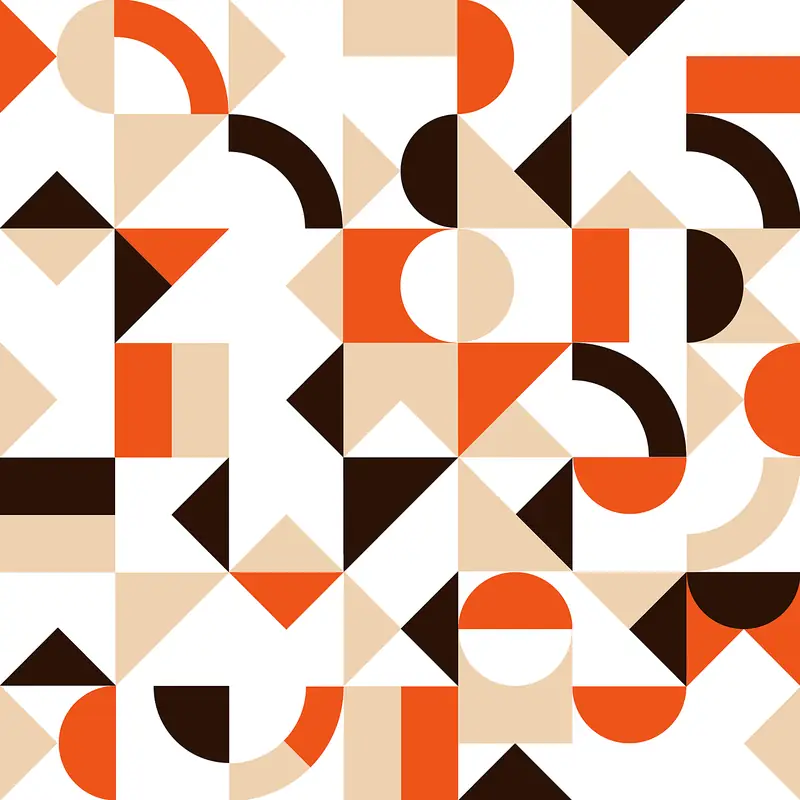
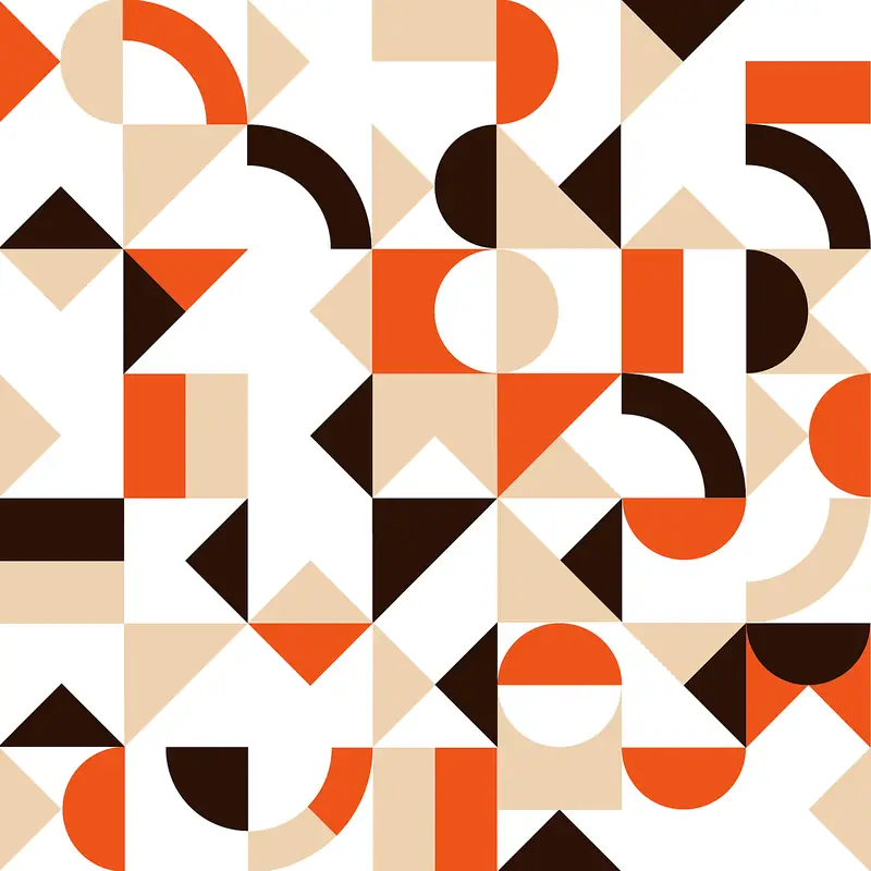
The negative space between letters gave us a lot of forms to reuse. These forms later became the basis of the patterns in the brand identity, with curved forms contrasted against sharp angles.
Tāne
Tāne is the main icon of NZ Trade Group’s existing brand assets, a visual icon that sits alongside the wordmark. Broken down into basic forms, he is made from circles, triangles and rectangles.
Because NZ Trade Group did not have any existing patterns, I took these core geometric shapes shared across both the Konnect logo and the Tāne icon and integrated them into the design system through a grid system.
K
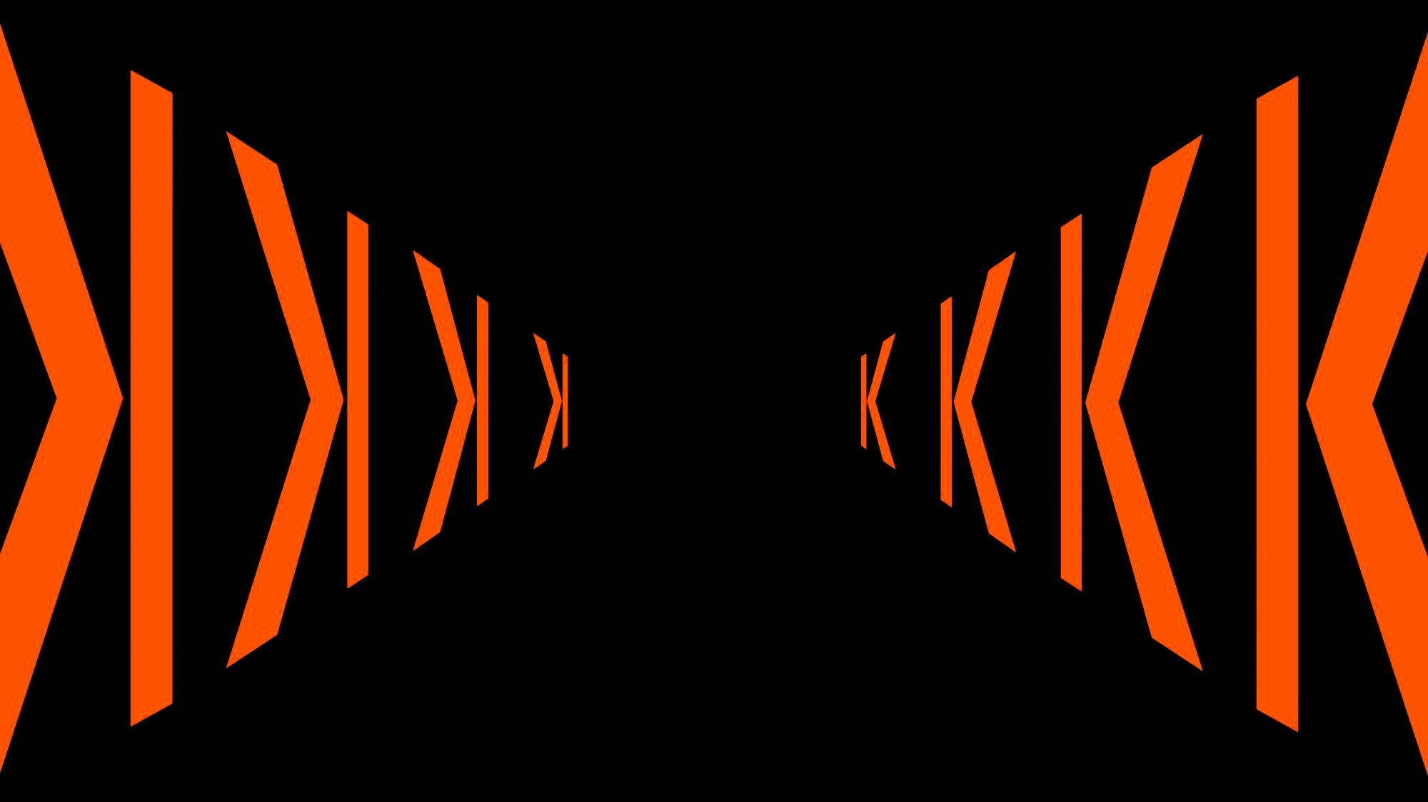
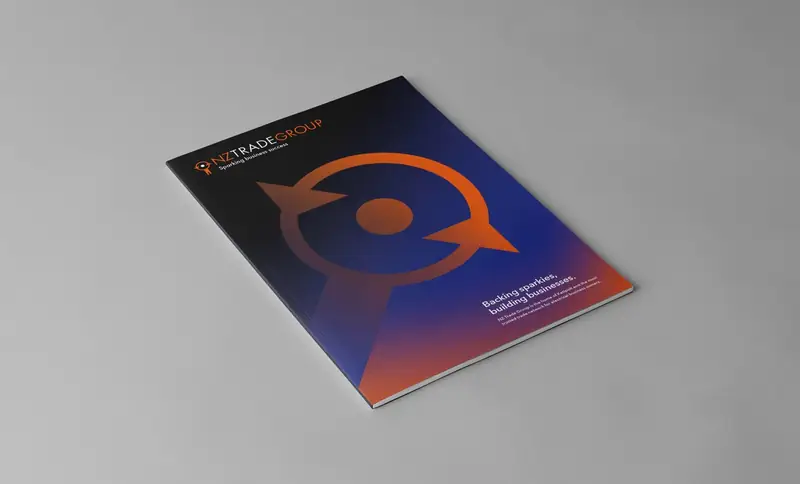
After drawing the K in the Konnect logo, I realised it also looked like a backwards skip button, like the one on a keyboard or music app that skips to the previous song.
This was a particularly good observation at this stage because the conferences also needed to celebrate NZ Trade Group’s 20th anniversary in business. I repurposed the K into an arrow that indicated direction and a transition through time.
The K also represents Katipolt, our in-house software for tradies, tying a shift in time to the idea of progress in technology and software development. It came to life through motion graphics that rewound through history, skipping back through the years to celebrate NZ Trade Group’s progress.
Cast shadows
Triangles were also used to further associate the design with its audience of Kiwi electricians.
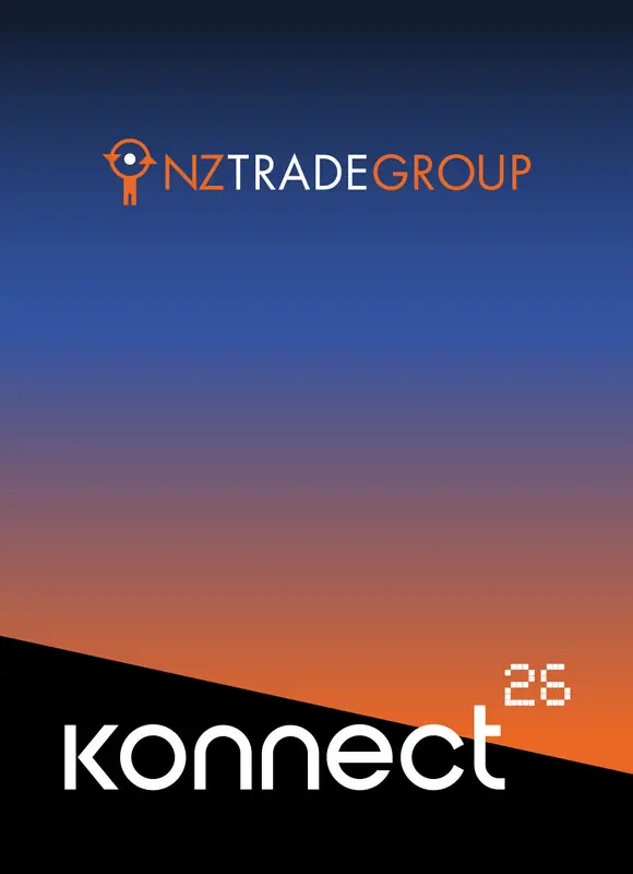
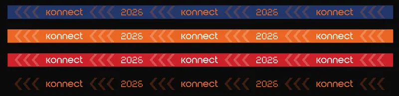
One of an electrician’s core roles is installing, repairing and maintaining lighting in Kiwi homes. Triangles represent long, outstretched cast shadows contrasted with large areas of light, like a door creaking open and light spilling into a room. This concept is shown in the event lanyard design.
Disconnected, connecting, connected
Before the conference identity, the brand had two core colours: orange and blue. For Konnect I added dynamic gradients.
I suggested orange best represented NZ Trade Group, as it was already used most consistently to show the community side of the business, and blue could represent Katipolt, the software side, which had no brand guides or colour associations yet. The blue to orange gradient therefore represents the business as a whole.
In the Konnect branding, the gradient represents warmth and closeness. Circles on the outskirts are dark blue and fade into black, but as they come together and network, their colour shifts into bright orange. This represents the transition from feeling disconnected, to connecting with others, to being fully connected after the conference.
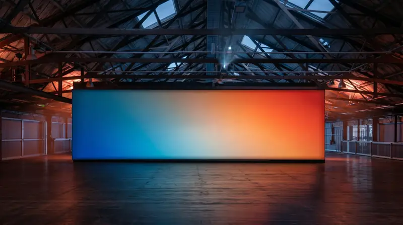
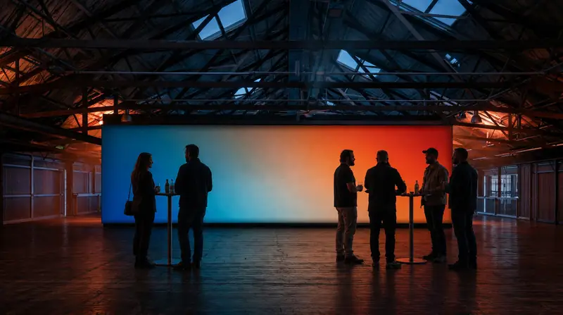
Stage concept
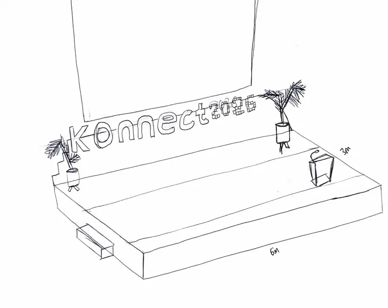
LED Wall concept
Lanyard design
Location announcement posts
 nztradegroup
 nztradegroup
 nztradegroup
Carousel post
nztradegroup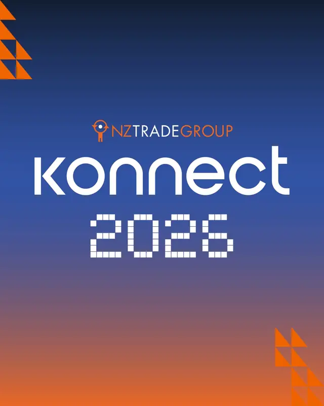 nztradegroup
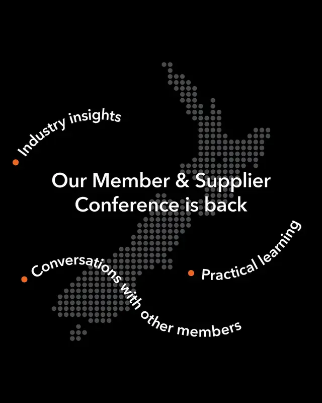 nztradegroup
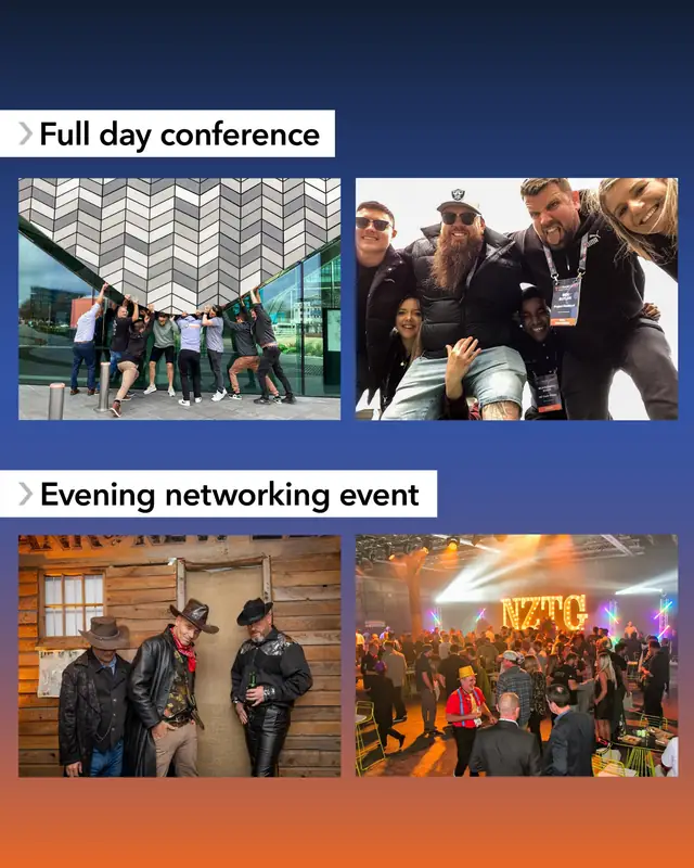 nztradegroup
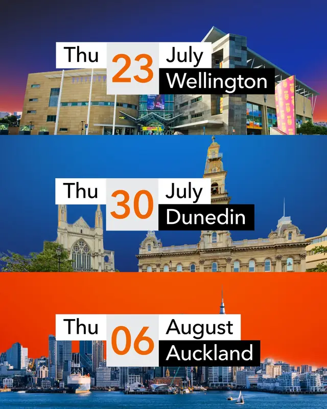 nztradegroup
 nztradegroup
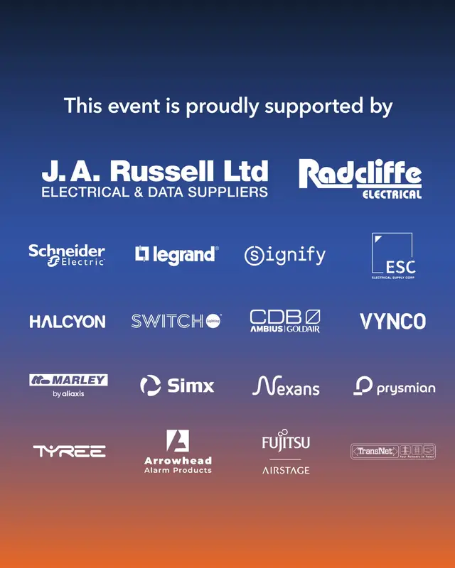
Animated posts
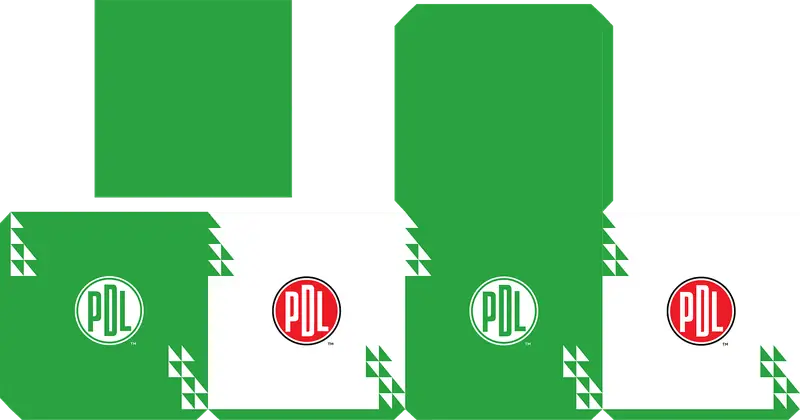
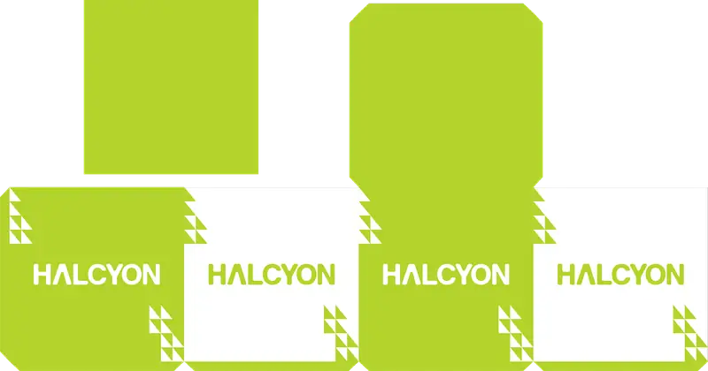
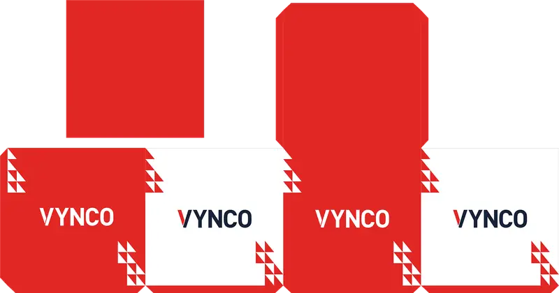
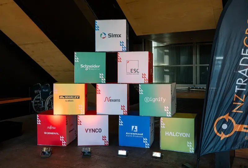
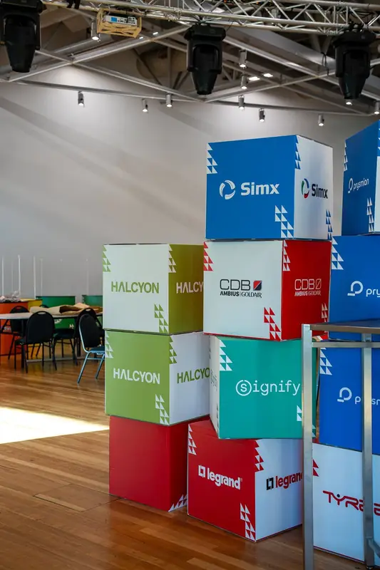
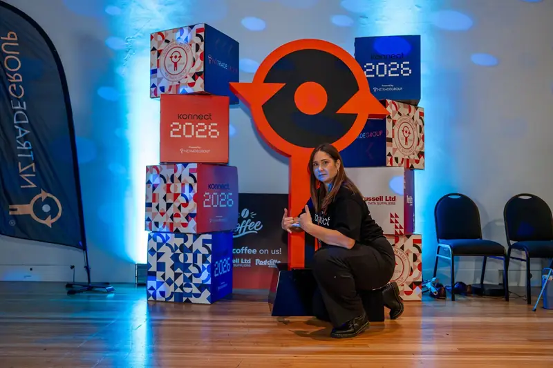
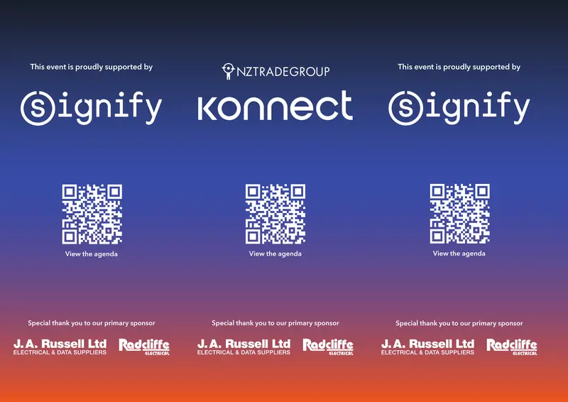
Stackable sponsor boxes

























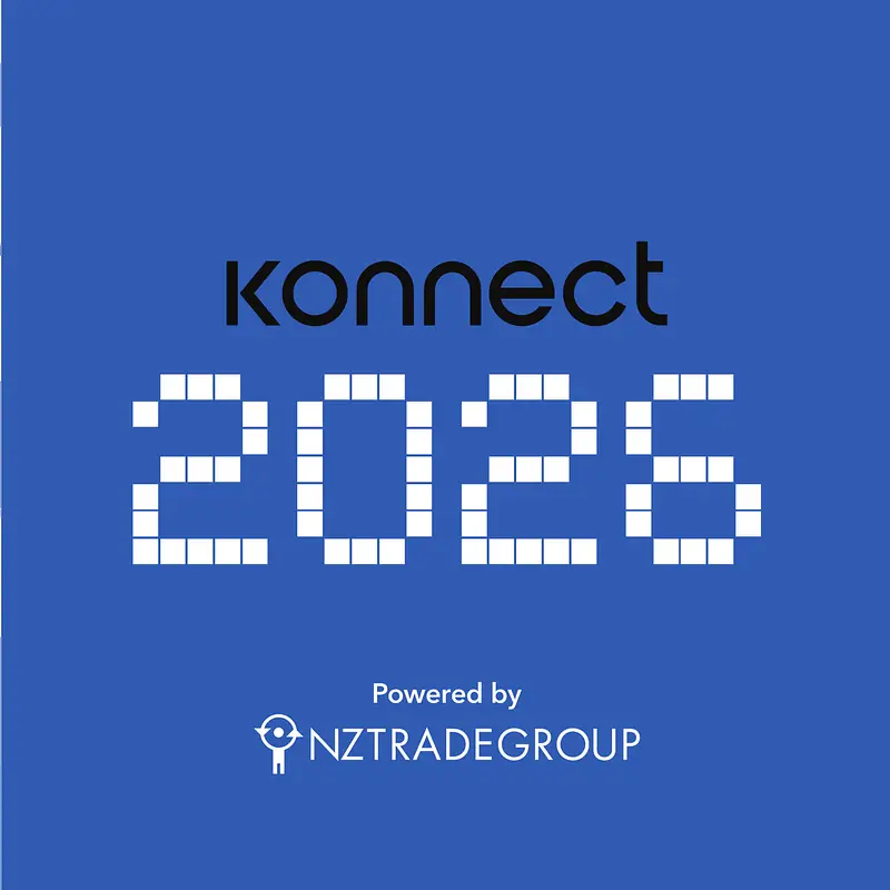



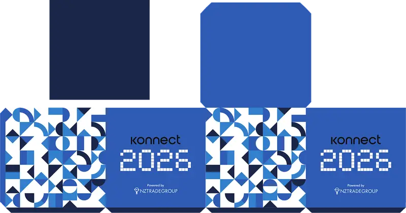
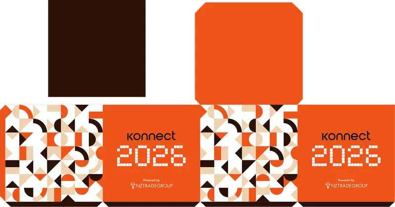
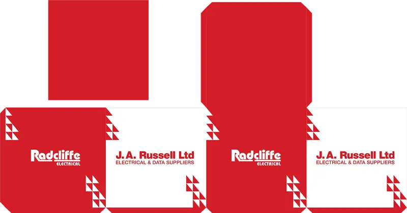
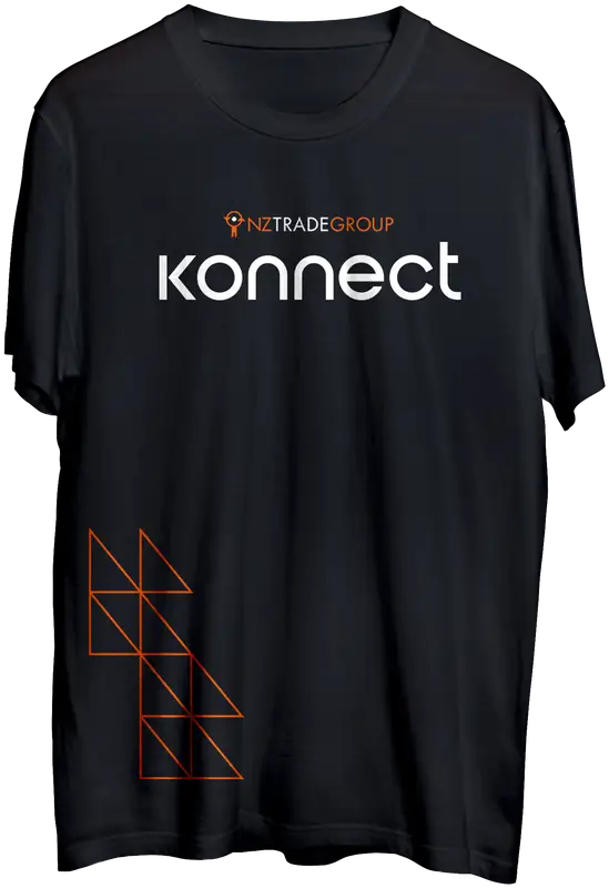
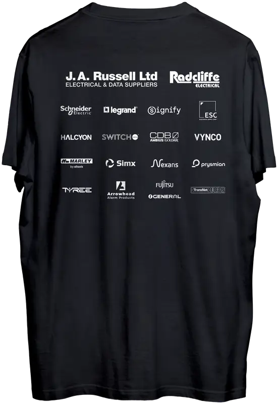
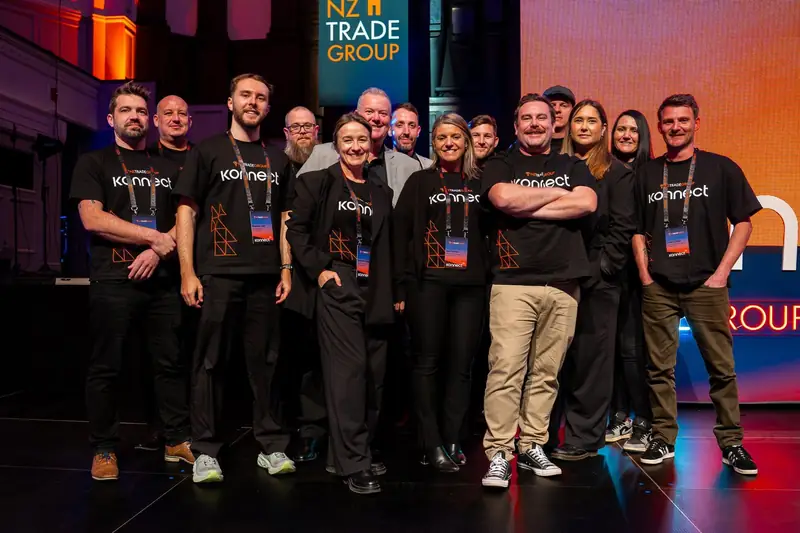
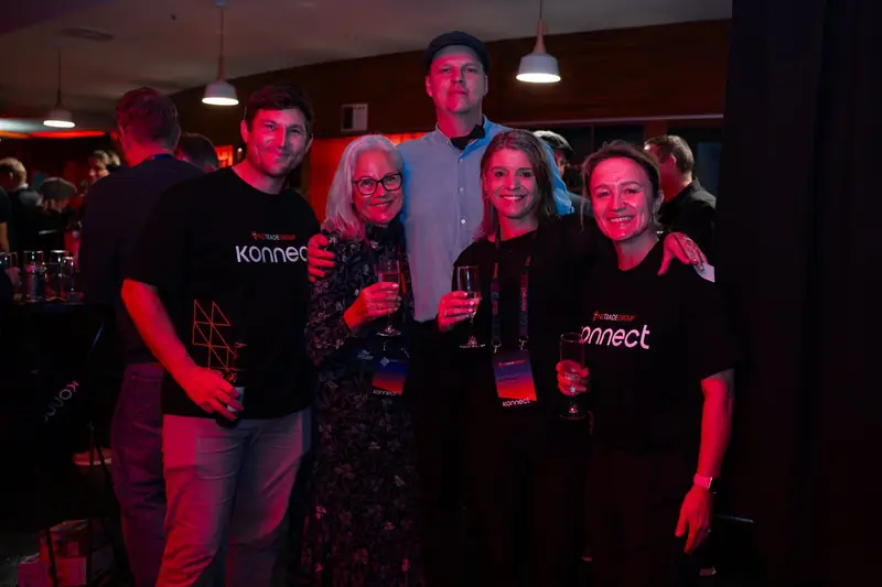
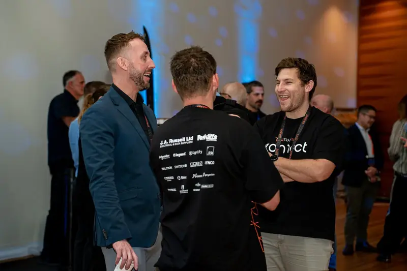
Shirt design
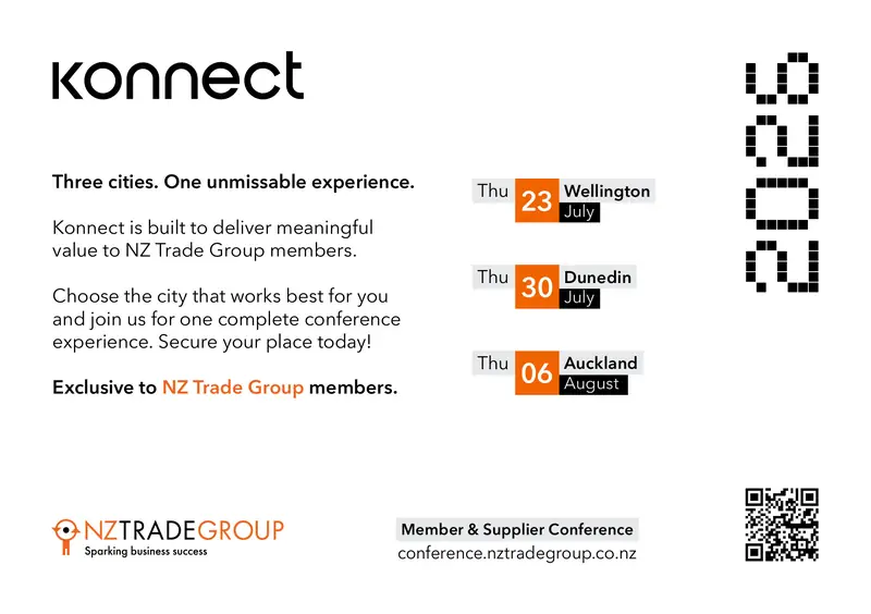
A5 Promotional Hand out
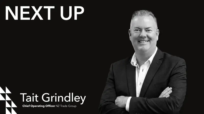
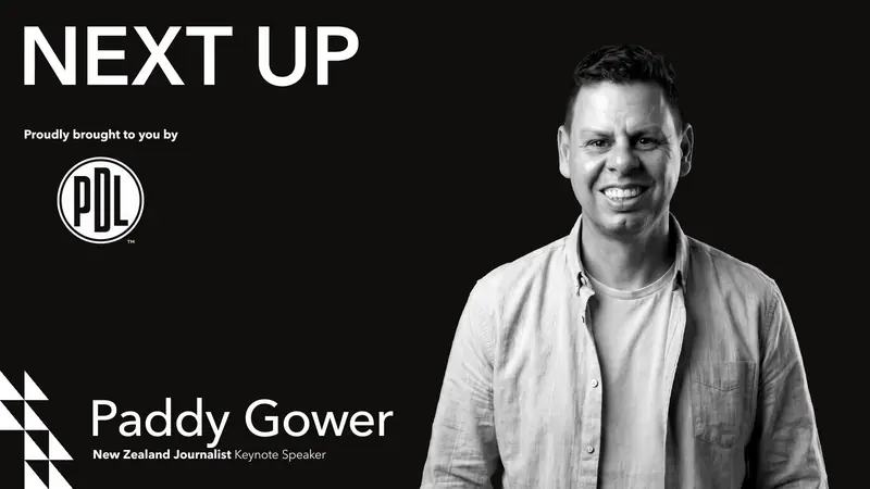
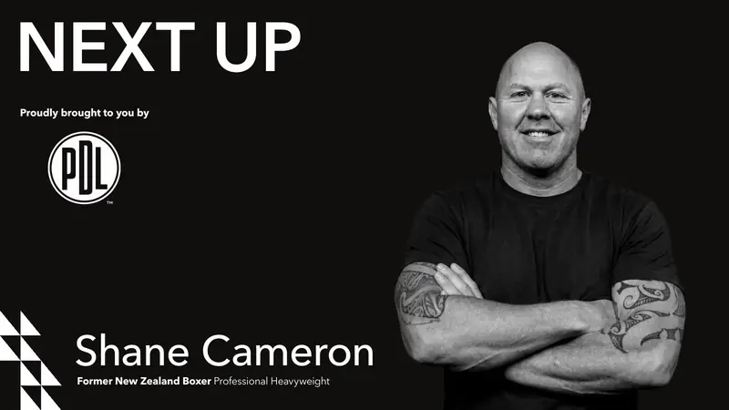
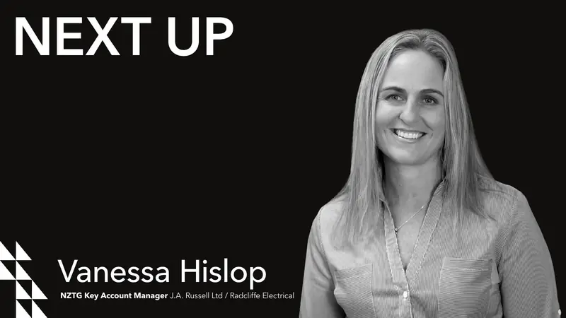
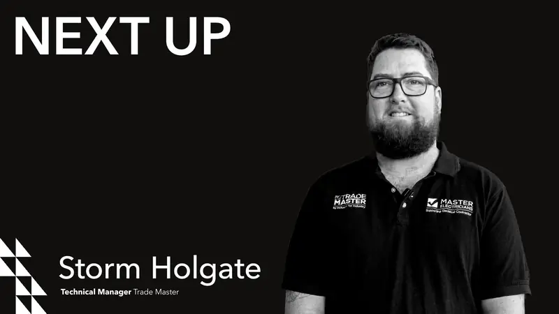
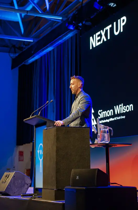
Next up speaker slides

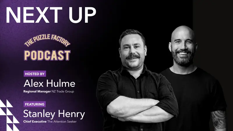
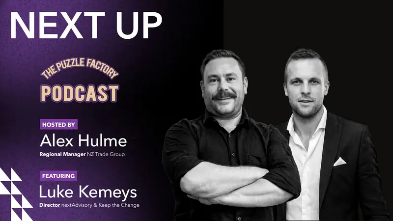
Puzzle Factory Podcast animated wall projection
Wall projections
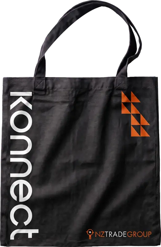
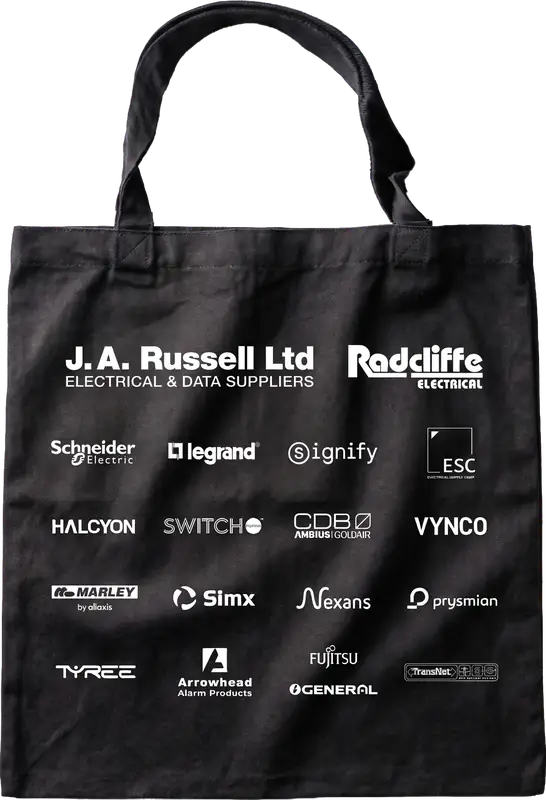
Tote bag design
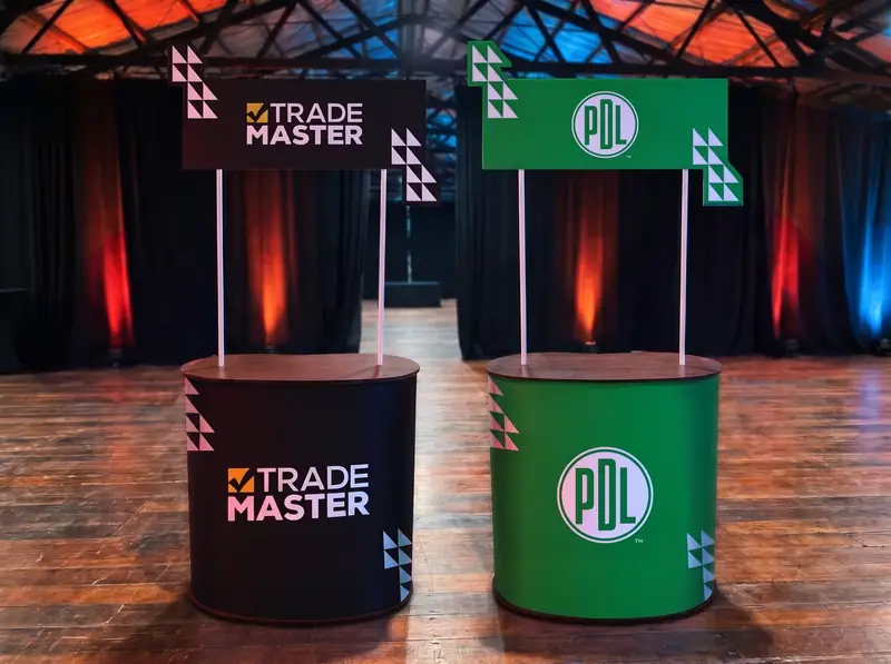
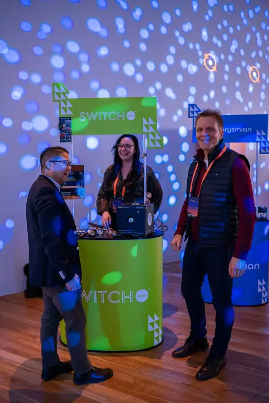
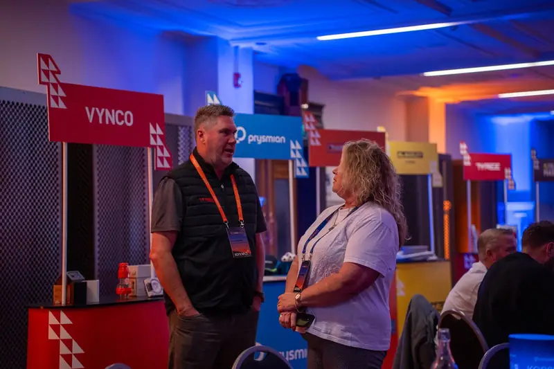
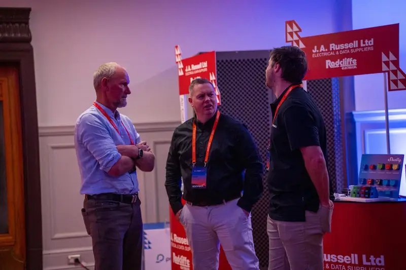
Supplier booths
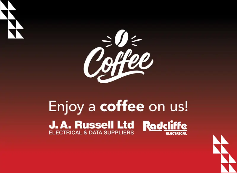
Coffee stand design
Animated Tāne Hold Screen
Pen and notebook design
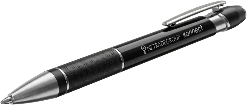

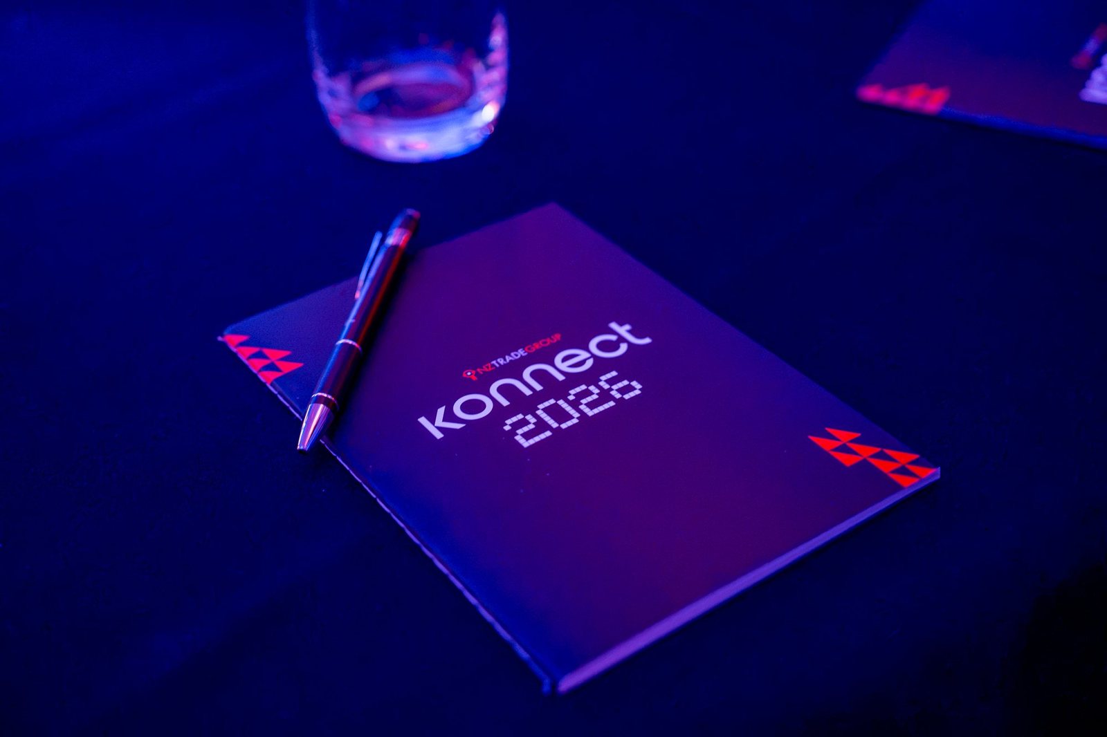
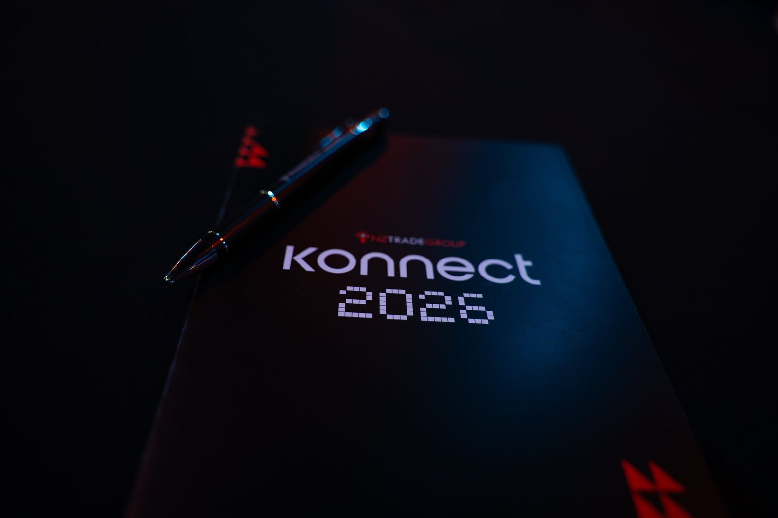
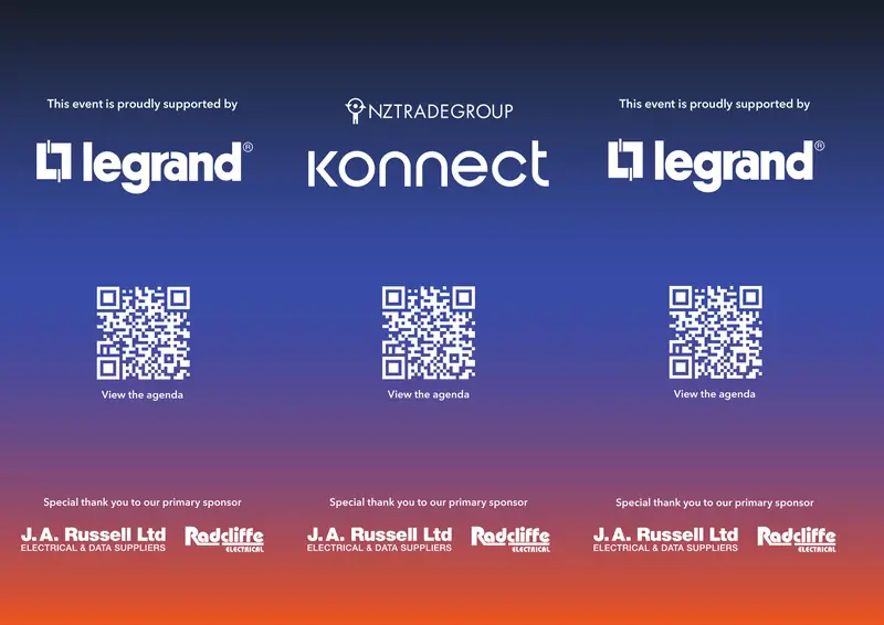
Table toppers
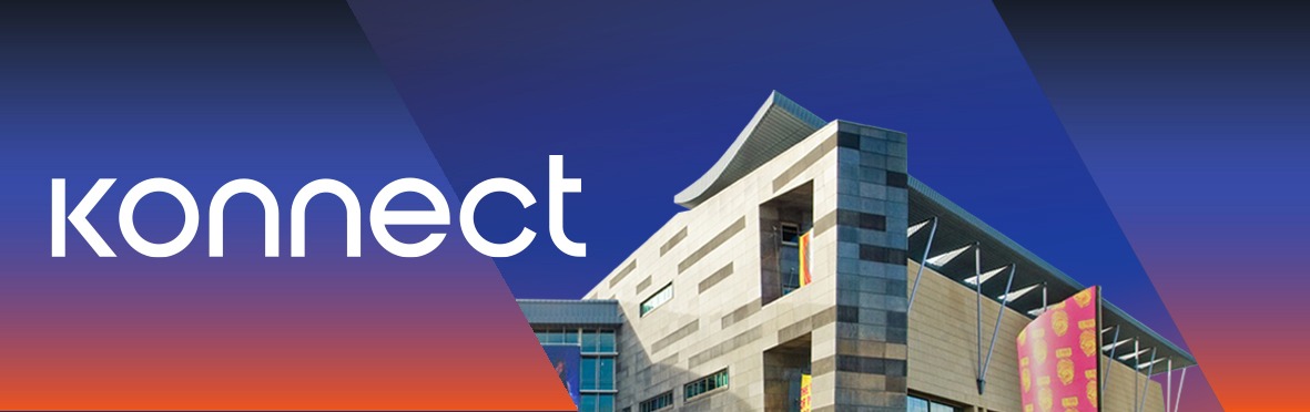
EDM header
See more NZ Trade Group projects
Shared with permission from NZ Trade Group